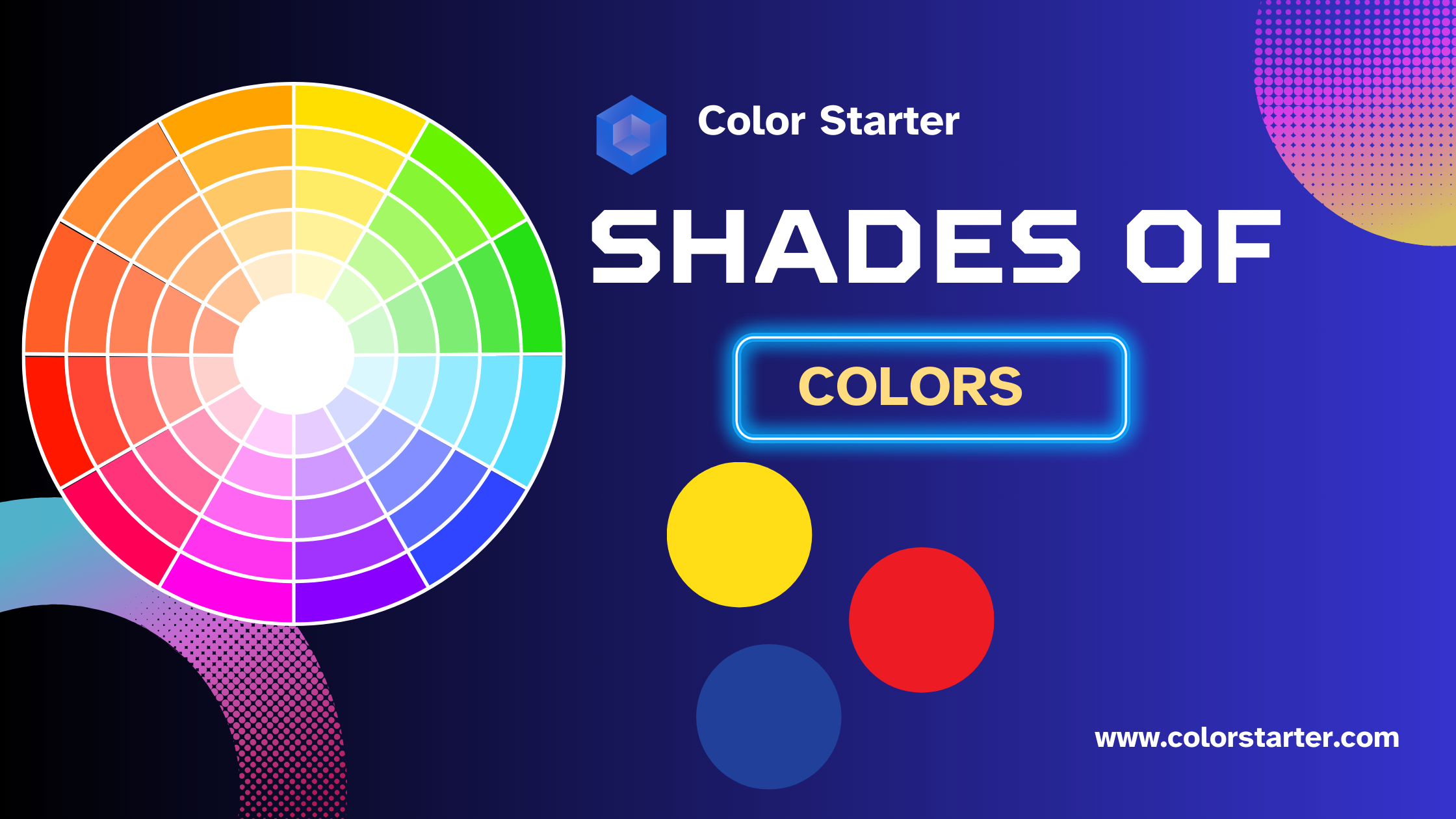
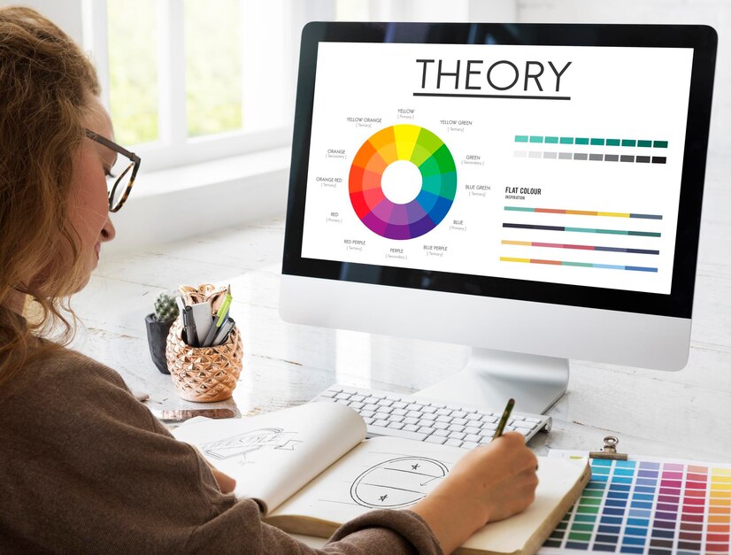
In the world of design, understanding and effectively utilizing the vast array of colors is a fundamental skill. Each shade and hue carries its own emotional and visual impact, making it crucial for designers to master the art of color theory. This guide delves into the various shades of colors, from primary to tertiary, and explores the endless combinations that can be achieved.
By providing a comprehensive list of color names and categories, this article aims to equip designers with the knowledge to create visually stunning and emotionally resonant designs. Whether you’re looking to infuse energy with warm colors, evoke calmness with cool tones, or add sophistication with neutral palettes, mastering these shades will enhance your creative projects. Dive in and explore the vibrant world of color combinations to unlock new depths of creativity.
Discovering Different Shades of Colors and Their Names
Before we dive into specific shades, it’s crucial to understand what we mean by “shades.” In the realm of color theory, a shade is produced by adding black to a base color, darkening its overall appearance. This is different from a tint, which lightens a color by adding white. Together, shades and tints create a complex and rich palette for any designer to explore.
Primary Colors
Primary colors, consisting of red, blue, and yellow, are the foundation of all other colors and cannot be created by mixing other hues. They are strong, vibrant, and bold, making them essential in color theory.
- Fundamental building blocks of color
- Cannot be created by mixing other colors
- Used to create secondary and tertiary colors
Secondary Colors
Secondary colors, which include green, orange, and purple, are formed by mixing two primary colors. These colors often bring harmony and balance to various designs and are naturally eye-catching.
- Created by mixing two primary colors
- Often used to create harmony and balance
- Commonly found in nature
Tertiary Colors
Tertiary colors are created by mixing a primary and a secondary color, resulting in a wide range of hues like red-orange and blue-green. These shades add complexity and depth to color palettes, making them versatile in design applications.
- Mix of a primary and a secondary color
- Offers a wide range of hues
- Adds complexity and depth to palettes
Warm Colors
Warm colors such as red, orange, and yellow are stimulating and attention-grabbing, often used to create a cozy and inviting atmosphere. They are associated with sunlight and heat, which can make spaces feel smaller and more intimate.
- Evoke warmth and energy
- Associated with sunlight and heat
- Create a cozy and inviting atmosphere
Cool Colors
Cool colors like blue, green, and purple evoke calmness and tranquility, often linked to water and sky. These colors are soothing and relaxing, used to create a sense of spaciousness and calm in a room, making spaces feel larger and more open.
- Evoke calmness and tranquility
- Associated with water and sky
- Soothing and relaxing atmosphere
Neutral Colors
Neutral colors, including black, white, grey, beige, and brown, are versatile and timeless. They serve as a backdrop for other colors and help create a balanced and understated look. Neutral tones are essential in minimalist and modern designs, adding sophistication and elegance to any space.
- Versatile and timeless
- Serve as a backdrop for other colors
- Create a balanced and understated look
- Essential in minimalist and modern designs
- Can evoke sophistication and elegance
The Ultimate List of Shades of Colors
Colors are more than just visual elements; they are powerful tools that shape our experiences and emotions in profound ways. Whether it’s the serene blues of the ocean or the passionate reds of a sunrise, each color theory tells a unique story and evokes distinct feelings. In this comprehensive guide, we invite you to explore the full spectrum of shades that enliven our world. We’ll take you through an in-depth journey, uncovering the rich tapestry of color shades names and their traits.
Shades of Blue Color

Blue is often associated with calmness and stability. Whether it’s the deep navy of the night sky or the bright azure of a summer day, different shades of blue color can evoke a wide range of emotions. According to color theorist John Smith, “Blue shades are incredibly versatile, perfect for both corporate designs and creative projects.” The shade of blue you choose can significantly impact the overall mood of your project. For instance, light blue can create a sense of tranquility and openness, often used in healthcare and wellness design. On the other hand, dark blue can convey authority and professionalism, making it a popular choice for corporate branding and logos.
Blue is calming and trustworthy, with shades spanning from pale baby blue to deep navy. Each shade of blue can bring a different emotional response.
- Light blues are soothing and often used in relaxation areas.
- Mid-tones like sky blue are associated with tranquility and calm.
- Dark blues, such as navy, convey professionalism and authority.
- Blue is often used in corporate designs for its trustworthiness.
- This color can create a sense of spaciousness and openness in design.
Read Next in Line: Decode Color Meanings and Symbolism – Guide to Colors
Shades of Pink Color

Pink is playful and romantic. From the boldness of hot pink to the gentleness of blush, pink shades can add a touch of whimsy and femininity to your designs. Hot pink can be used to grab attention and convey a sense of urgency and excitement. Softer shades like blush and baby pink are perfect for creating a sense of softness and tenderness, often seen in beauty and skincare products. Pink can also be combined with other colors to create a modern and sophisticated palette, making it a versatile choice for various design projects.
Pink is delicate and feminine, with a spectrum ranging from soft baby pink to bold magenta.
- Baby Pink: Evokes feelings of romance and tenderness.
- Rose Pink: Conveys a sense of playfulness and charm.
- Salmon Pink: Soft and soothing, suitable for calming designs.
- Hot Pink: Bold and vibrant, often used to attract attention.
- Fuchsia: Brings drama and sophistication.
Shades of Purple Color
Purple is often linked to luxury and creativity. The rich tones of royal purple can add a regal touch, while the lighter lavender shades bring a sense of serenity. Purple is also associated with spirituality and mysticism, making it a popular choice for designs related to personal growth and mindfulness. The depth of shades available, from the deep and dramatic plum to the soft and calming lilac, allows designers to create a wide range of atmospheres and moods. When used sparingly, purple can act as an accent color to highlight important elements in your design.
Purple is luxurious and creative, with a spectrum that ranges from soft lavender to deep plum.
- Light purples like lavender can evoke a sense of whimsy and calm.
- Mid-purples are often associated with creativity and imagination.
- Dark purples, such as royal purple, suggest luxury and sophistication.
- Purple is often used in design elements to emphasize quality and uniqueness.
- This color can create an emotional and dramatic effect in visual designs.
Shades of Red Color

Red is the color of passion and energy. From the deep allure of burgundy to the vibrant pop of cherry, shades of red color can make a powerful statement in any design. “Red shades are perfect for designs that need to command attention,” says graphic designer Alice Johnson. Red can evoke strong emotions, from love and desire to urgency and alarm, making it a versatile tool for manipulating the viewer’s feelings. Darker shades like maroon and crimson are often used to convey sophistication and elegance, while brighter hues like scarlet and ruby are eye-catching and dynamic.
Red is bold and passionate, with a range encompassing bright cherry red to dark burgundy.
- Red is often associated with excitement and energy.
- Lighter shades like coral can evoke feelings of warmth and happiness.
- Darker reds are linked to power and determination.
- Red is commonly used to grab attention and incite action.
- It can also stimulate appetite and is frequently seen in food-related designs.
Shades of Brown Color

Brown shades offer a sense of reliability and warmth. Earthy tones like chocolate and caramel can add a grounded, rustic feel to your designs. Brown is often associated with nature and the outdoors, making it a popular choice for eco-friendly and organic products. It also evokes a sense of stability and comfort, ideal for creating a welcoming and cozy atmosphere. From the rich depth of espresso to the soft, creamy hues of latte, brown can be used to add richness and texture to your design work.
Brown is earthy and stable, offering a range from light beige to rich chocolate.
- Light browns like beige create a sense of warmth and approachability.
- Mid-tone browns such as taupe provide a neutral, sophisticated backdrop.
- Dark browns add richness and depth to a design.
- Brown often symbolizes reliability and stability.
- It is commonly used in designs to convey a natural or rustic feel.
Shades of Yellow Color

Yellow is cheerful and energizing. From the muted mustard to the bright sunshine yellow, these shades can bring a sense of happiness and optimism. Yellow is often used to grab attention and is commonly seen in warning signs and advertisements. Softer shades like pale lemon and light gold can create a warm and inviting ambiance, perfect for hospitality and event design. Yellow can also stimulate mental activity and creativity, making it a great choice for educational and creative projects.
Yellow is cheerful and energetic, encompassing shades from bright lemon to deep mustard.
- Bright yellows can evoke happiness and positivity.
- Softer yellows like buttercream create a sense of warmth and comfort.
- Golden yellows are often associated with wealth and luxury.
- Yellow is commonly used to grab attention and convey a sense of urgency.
- It can also stimulate mental activity and is frequently used in educational designs.
Shades of Orange Color

Orange is vibrant and invigorating. From the soft tones of peach to the boldness of neon orange, these shades can add a burst of energy to your designs. Orange is often used to create a sense of excitement and enthusiasm. It is a colour that stands out and is therefore commonly used in design elements that require attention, such as call-to-action buttons and advertisements. The versatility of orange makes it suitable for a variety of settings, from the warm, inviting vibes of a cozy café to the dynamic, energetic feel of a sports event.
Orange is vibrant and stimulating, with a range spanning from light peach to deep burnt orange.
- Light oranges like peach can create a sense of warmth and innocence.
- Mid-tone oranges such as pumpkin are associated with creativity and enthusiasm.
- Dark oranges, like burnt orange, add depth and a sense of robustness.
- Orange is often used to evoke excitement and attract attention.
- This color can also provide a sense of warmth and is commonly seen in autumn-themed designs.
Shades of Grey Color

Grey is sophisticated and neutral. From the lightness of dove grey to the depth of charcoal, grey shades can add a modern and elegant touch. Grey is immensely versatile, acting as a balancing element that can tone down more vibrant colours or enhance a minimalist aesthetic. Light grey shades can evoke a sense of calm and simplicity, often used in contemporary design. Darker greys, like anthracite, offer a sense of strength and formality, ideal for luxurious and high-end brands.
Some unique traits of grey color are as follows.
- Warm Greys: Featuring undertones of brown or beige, warm greys create a cozy and inviting atmosphere.
- Cool Greys: With hints of blue or green, cool greys offer a serene and modern vibe.
- Silver Grey: Light and reflective, silver grey adds a touch of elegance and sophistication.
- Charcoal Grey: Deep and bold, charcoal grey provides a dramatic and powerful visual impact.
- Platinum Grey: This shade is light and metallic, often conveying a sense of luxury and high-end appeal.
- Ash Grey: Soft and neutral, ash grey is perfect for creating minimalist and contemporary designs.
- Slate Grey: A darker shade with bluish undertones, slate grey is associated with professionalism and stability.
Shades of White Color

White is pure and clean. Different shades of white, from ivory to snow, can add a minimalist and fresh look to your designs. White is often used to create a sense of space and openness, making it ideal for modern, uncluttered design settings. It can also be combined with other colours to create sharp contrasts or to highlight specific elements of design. Shades like creamy white or off-white can add warmth and make a design feel more inviting. White can also symbolize new beginnings, making it a popular choice for wedding and event designs.
White is pure and clean, offering a range from bright snow to soft ivory.
- Snow White: Conveys purity and freshness.
- Ivory: Adds a touch of elegance and warmth.
- Linen: Soft and neutral, often used in minimalist designs.
- Eggshell: Creates a subtle and warm feel.
- Alabaster: Classic and timeless, suitable for formal settings.
Shades of Teal Color

Teal is a balanced mix of blue and green, offering a calming yet invigorating effect. From the softness of mint teal to the richness of dark teal, these shades can add a unique touch. Teal is often used in environments that aim for a serene and refreshing feel, such as spas and wellness centers. It is also a popular choice in interior design due to its versatility and ability to match with various other colours. The rich and deep shades of teal can evoke a sense of sophistication and elegance, while lighter hues can create a playful and dynamic atmosphere.
Teal is calming and sophisticated, with a palette from light aqua to deep teal.
- Light Aqua: Refreshing and invigorating, perfect for modern designs.
- Turquoise: Evokes a sense of tranquility and tropical vibes.
- Seafoam: Soft and soothing, reminiscent of nature.
- Dark Teal: Adds depth and sophistication.
- Peacock Teal: Rich and vibrant, often used for bold accents.
Shades of Tan Color

Tan shades are neutral and versatile. They can range from the lightness of sand to the deeper tones of camel, adding warmth and sophistication. Tan is often used in fashion and interior design to create a timeless, classic look. It can be paired with other earth tones to create a harmonious and cohesive colour scheme. Lighter shades of tan can evoke a sense of calm and tranquility, making them ideal for bedroom and living room designs. Darker shades, such as camel, can add depth and richness, perfect for accents and focal points in a design.
Tan is warm and inviting, offering a spectrum from light sand to deeper camel.
- Sand: Soft and neutral, creates a calm and relaxed feel.
- Camel: Rich and warm, often associated with timeless elegance.
- Khaki: Earthy and natural, perfect for casual and outdoor themes.
- Buff: Gentle and soft, provides a warm backdrop.
- Honey Tan: Vibrant and warm, adds a sunny disposition.
Shades of Taupe Color

Taupe is a blend of grey and brown, offering a neutral yet rich palette. These shades can add a sense of understated elegance to your designs. The versatility of taupe makes it ideal for a wide range of applications, from interior design to fashion. Lighter shades of taupe, such as mushroom and pearl, can create a soft and inviting atmosphere, while darker shades like slate and mocha can add a sense of depth and sophistication. Taupe can also be combined with other neutrals to create a subtle and refined palette.
Taupe is neutral and versatile, ranging from light greige to dark mushroom.
- Greige: A blend of grey and beige, creating a modern, neutral tone.
- Light Taupe: Soft and warm, ideal for understated elegance.
- Mushroom: Rich and earthy, adding depth without being overpowering.
- Stone: Classic and timeless, suitable for various design styles.
- Sandy Taupe: Subtle and natural, provides a calm backdrop.
Shades of Gold Color

Gold is opulent and luxurious. From the bright gleam of metallic gold to the subtlety of goldenrod, these shades can add a touch of glamour. Gold is often used to signify wealth, success, and prestige, making it a popular choice for high-end branding and design projects. Metallic gold can create a striking visual impact and is commonly used as an accent to highlight key elements. Softer shades, like buttercup and old gold, can evoke a sense of warmth and tradition. Gold can also be paired with other rich tones like deep reds and purples to create a regal and sophisticated palette.
Gold is luxurious and radiant, spanning from bright metallic gold to rich antique gold.
- Bright Gold: Eye-catching and regal, often used for opulence.
- Champagne Gold: Subdued and elegant, ideal for sophisticated designs.
- Antique Gold: Adds a sense of history and luxury.
- Rose Gold: Soft and feminine, modern and trendy.
- Old Gold: Classic and rich, perfect for traditional designs.
Shades of Black Color

Black is powerful and authoritative. Different shades of black, from soft charcoal to deep ebony, can add depth and drama. Black is a timeless and versatile colour, often associated with sophistication and elegance. It can create a sleek and modern look when used in minimalistic designs or add a touch of drama to more traditional designs. Black is also commonly used to create high contrast, making it ideal for typography and branding. However, too much black in a design can be overwhelming, so it should be used sparingly and balanced with other shades.
Black is powerful and elegant, with a variety of shades from soft charcoal to deep jet black.
- Charcoal: Sophisticated and versatile, suitable for modern aesthetics.
- Onyx: Rich and dramatic, used for bold statements.
- Jet Black: Pure black, symbolizes power and elegance.
- Graphite: Soft and neutral, ideal for subtle designs.
- Ebony: Deep and luxurious, adds an element of mystery.
Related Articles:
- Understanding Color Psychology: Influence and Meaning of Colors
- Colors That Start with A: A Vibrant Journey from Amaranth to Azure
Conclusion
Understanding the different shades of colors is crucial for any designer aiming to create impactful and visually appealing work. Mastering the art of blending primary, secondary, and tertiary colors allows for the creation of harmonious and balanced designs. Utilizing warm colors to add energy and coziness, cool colors to evoke tranquility and spaciousness, and neutral colors to ground and add sophistication can make a significant difference in the overall aesthetic appeal.
In essence, the right shades of colors not only enhance the visual impact but also convey emotions and tell a compelling story. So, by experimenting with various shades and staying attuned to the purpose and meaning behind each choice, you can craft designs that stand out and resonate deeply with audiences. Dive into the world of colors and unlock endless creative possibilities to set your work apart.

Elara Farrow is the Senior Content Strategist & Contributor at ColorStarter, where she harnesses her expertise in colour theory and design principles to create engaging materials for our audience. With a Master’s degree in Graphic Design from the Rhode Island School of Design, Elara has cultivated a deep understanding of how colour influences perception and emotion. Her journey in the design world began with a fascination for vibrant palettes.