As a lifelong color enthusiast and professional designer, I’ve always been fascinated by the power of color to transform spaces, evoke emotions, and convey messages. In my journey through the rainbow, I’ve found that colors starting with D offer a particularly diverse and intriguing palette. From the darkest midnight blues to the softest dove grays, these hues span a spectrum that’s both versatile and captivating.
Whether you’re a seasoned designer looking to expand your color repertoire or simply someone who appreciates the beauty of hues in your daily life, the D color family has something extraordinary to offer. I’ve used these colors in countless projects, and each time, I’m amazed by their ability to breathe life into designs and spaces.
Join me on this colorful expedition as we explore the characteristics, psychological impacts, and practical applications of these delightful D hues. I’ll share some personal insights from my design experiences and how these colors have shaped my work and surroundings. Let’s embark on this vibrant voyage and discover the delightful world of D colors! Explore here the complete list of colors that starts from A and ends with z.
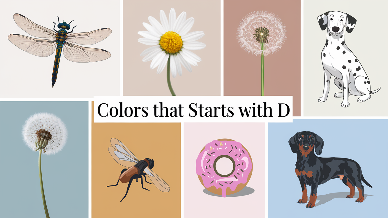
Top-Notch List of Colors That Start With D – From Vibrant to Subtle
Let’s start our colorful journey with some of the more familiar D colors. These are the hues you might recognize from your crayon box or your favorite paint store. Each one has its own unique charm and potential to transform a space or design.
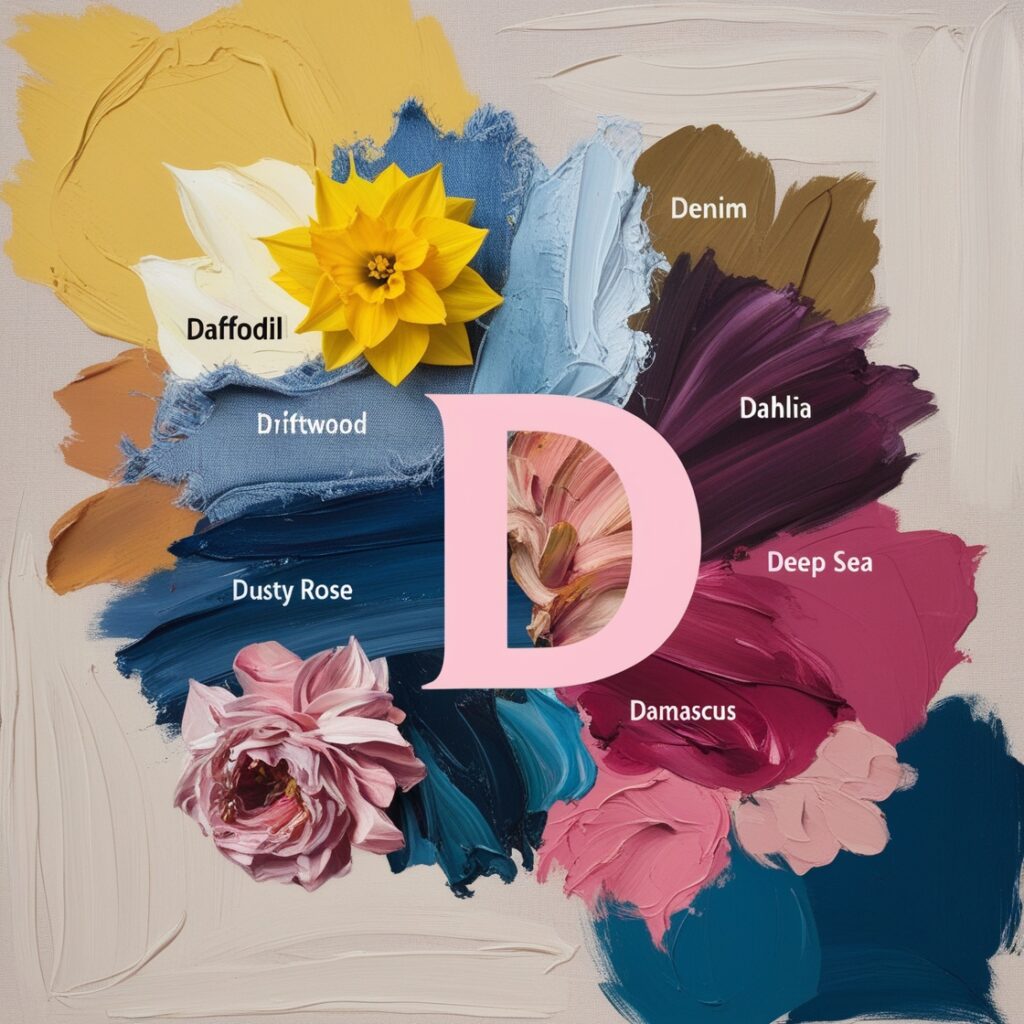
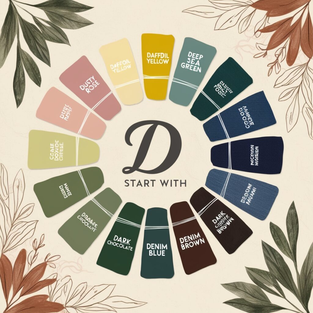
Deep Blue

Ah, deep blue – a color that never fails to mesmerize me. It reminds me of diving into the ocean on a summer vacation, surrounded by the vast, mysterious depths. This intense, rich shade of blue evokes feelings of serenity, trust, and intelligence. It’s a popular choice for corporate branding, as it conveys professionalism and stability. I once used deep blue as the primary color for a client’s financial advisory website, and it perfectly captured the sense of trustworthiness they wanted to project.
Daffodil

Daffodil is a cheerful, sunny yellow that never fails to bring a smile to my face. It reminds me of the first signs of spring, with daffodils poking their bright heads through the last remnants of winter snow. This vibrant hue is associated with joy, optimism, and energy. It’s fantastic for accent pieces in interior design or for brands wanting to convey a sense of happiness and vitality. I once painted an accent wall in my home office this color, and it never fails to boost my mood during long work days.
Dark Green

Dark green is a color that transports me straight to a lush, mysterious forest. It’s a deep, rich shade that evokes feelings of growth, harmony, and fertility. This color is often used in eco-friendly branding to represent nature and sustainability. I remember using dark green prominently in a branding project for an organic food company, and it perfectly captured their commitment to natural, wholesome products.
Dusty Rose

Dusty rose is a soft, muted pink that brings a touch of vintage charm to any design. It reminds me of flipping through old photo albums, with faded images of bygone eras. This color is associated with romance, nostalgia, and femininity. It’s become increasingly popular in fashion and interior design for its subtle, sophisticated appeal. I recently used dusty rose as part of a color scheme for a wedding invitation design, and the bride was thrilled with how it added a touch of timeless elegance.
Dazzling and Uncommon Colors That Start with D
Now that we’ve covered some of the more familiar D colors, let’s venture into less charted territory. These obscure hues might not be household names, but they offer unique and exciting possibilities for designers and color enthusiasts.
Dandelion

Dandelion is a bright, cheerful yellow that’s slightly more muted than its daffodil cousin. It reminds me of lazy summer days spent in meadows, making wishes on dandelion seeds. This color radiates warmth and positivity, making it perfect for children’s products or brands wanting to convey a sense of playfulness. I once used dandelion as the primary color for a children’s book illustration project, and it brought the pages to life with its sunny vibrancy.
Duck Egg Blue

Duck egg blue is a soft, pale blue with a hint of green, reminiscent of… well, duck eggs! This delicate hue brings to mind clear spring skies and tranquil waters. It’s associated with calmness, clarity, and freshness. Duck egg blue has gained popularity in interior design, particularly for creating serene bedroom or bathroom spaces. In my own home, I used this color for bathroom walls, and it transformed the space into a peaceful, spa-like retreat.
Dragon’s Blood

Dragon’s blood is a deep, rich red that sounds like it came straight out of a fantasy novel. This intense hue is named after the vivid red resin of certain tropical trees. It evokes feelings of power, passion, and mystery. While it might be too bold for some applications, dragon’s blood can make a striking accent color in design or fashion. I once saw a stunning evening gown in this color at a fashion show, and it left a lasting impression with its dramatic flair.
Denim

Denim is a medium blue color that, as the name suggests, is reminiscent of blue jeans. It brings to mind casual comfort and timeless style. This versatile hue is associated with reliability, approachability, and a touch of nostalgia. Denim works well in both digital and print design, offering a friendly yet professional feel. I’ve used denim as a primary color in several web design projects, and it always seems to strike the right balance between casual and corporate.
The D-lightful Psychology of Colors That Start with D
Colors have a profound impact on our emotions and behaviors, often in ways we don’t consciously realize. Let’s explore the psychological effects of some of our top D colors:
Dandelion Yellow:
• Evokes feelings of happiness and optimism
• Stimulates mental activity and memory
• Can increase confidence and self-esteem
• May create a sense of warmth and welcome
Denim Blue:
• Promotes feelings of trust and dependability
• Encourages clear communication
• Creates a sense of calmness and serenity
• Can boost productivity in work environments
Desert Sand:
• Elicits feelings of warmth and comfort
• Promotes a sense of stability and groundedness
• Can create a nurturing, supportive atmosphere
• May evoke nostalgia or a connection to nature
Dark Green:
• Associated with growth, harmony, and balance
• Can promote a sense of refreshment and restoration
• Encourages feelings of stability and endurance
• May enhance concentration and focus
Dragon Fruit Pink:
• Stimulates energy and excitement
• Can increase heart rate and adrenaline
• Promotes feelings of confidence and assertiveness
• May enhance creativity and imagination
Duck Blue:
• Combines the calming effects of blue with the balance of green
• Promotes feelings of tranquility and peace
• Can reduce stress and anxiety
• Encourages introspection and deep thinking
Dodie Yellow:
• Creates a sense of cheerfulness without being overwhelming
• Promotes optimism and positive thinking
• Can stimulate mental activity and clarity
• Encourages friendliness and open communication
Dolphin Gray:
• Promotes feelings of calm and balance
• Encourages a sense of stability and maturity
• Can create an atmosphere of sophistication
• May promote compromise and neutrality
Understanding these psychological impacts can be incredibly valuable when choosing colors for various applications. Whether you’re designing a logo, decorating a room, or creating a website, considering the emotional responses these D colors can evoke will help you make more informed and effective color choices.
It’s important to note that while these psychological effects are generally observed, individual experiences with color can vary based on personal experiences, cultural backgrounds, and contextual factors. Always consider your specific audience and context when applying color psychology in your designs or spaces.
For a deeper dive into the fascinating world of color psychology, I recommend checking out the comprehensive guide at Color Psychology. This resource offers detailed insights into how different colors affect our minds and behaviors.
Remember, the power of color lies not just in its visual appeal, but in its ability to influence mood, behavior, and perception. By harnessing the psychological impact of these D colors, you can create more engaging, effective, and emotionally resonant designs and spaces.
Awe-Inspiring Colors That Start with D
Did you know there are rare and fascinating colors that start with D?
- Drab Olive: A muted green often used in military aesthetics.
- Dartmouth Green: A deep green associated with sophistication.
- Desert Sand: A subtle beige that embodies tranquility.
These lesser-known colors can add a unique touch to your design projects and stand out from more common hues.
Personal Experience with Colors Starting with D
In my years as a designer, I’ve seen firsthand how the right color choice can make or break a project. I remember one particular branding project for a tech startup where we experimented with various color schemes. When we introduced a deep blue into the mix, suddenly everything clicked. The client’s face lit up, and they exclaimed, “That’s it! That’s our brand!” It was a powerful reminder of how color can communicate a brand’s essence more effectively than words alone.
How Colors That Start with D Are Trending in Design
In 2024, colors that start with D are making waves in design trends:
- Daffodil Yellow: A favorite for spring/summer fashion collections.
- Desert Sand: Trending in minimalist interior designs.
- Dark Cyan: Popular in modern UI/UX designs for tech brands.
Incorporating these trendy hues can give your projects a modern, fresh appeal.
Exploring Shades and Tones of Colors That Start with D
Colors that start with D often come with multiple shades and tones, adding depth and versatility to your palette. Here are 10 remarkable shades:
- Deep Denim: A darker version of the classic denim color, great for contemporary designs.
- Dark Coral: A muted yet bold shade ideal for accents and vibrant designs.
- Dusty Rose: A soft and elegant pink, perfect for modern aesthetics.
- Dark Teal: A sophisticated mix of blue and green, ideal for luxurious interiors.
- Deep Lilac: A gentle purple with a deeper undertone, great for romantic themes.
- Desert Sand: A warm, neutral beige that embodies tranquility and minimalism.
- Dark Maroon: A rich, deep red often used in classic and formal designs.
- Dove Gray: A soft, neutral gray, perfect for minimalist and calming visuals.
- Deep Olive: A darker shade of green, associated with nature and earthy aesthetics.
- Dark Cyan: A bold blue-green tone often used in modern digital design.
Each of these shades offers distinct possibilities, whether you’re working on branding, home decor, or graphic design. By combining them thoughtfully, you can create stunning and cohesive palettes.
Frequently Asked Questions
To help you further explore the world of colors that start with D, I’ve compiled some of the most common questions I receive:
| What is the darkest color that starts with D? While “Dark Black” might seem like the obvious answer, one of the darkest colors starting with D is actually “Davy’s Grey,” a very deep, almost black shade of gray. Are there any D colors that are particularly trendy in interior design right now? Yes! Duck Egg Blue and Dove Grey have been incredibly popular in interior design over the past few years, offering a serene and sophisticated palette for home decor. What’s a good D color for creating a calming atmosphere? Dusk Blue is an excellent choice for creating a calming atmosphere. It’s a soft, muted blue that evokes the tranquility of twilight. Are there any D colors that are considered “power colors” in business settings? Deep Blue is often considered a power color in business settings. It conveys professionalism, trust, and authority. What’s a versatile D color that works well with many other colors? Dove Grey is incredibly versatile. As a neutral, it pairs well with both warm and cool colors, making it a fantastic base in many color schemes. |
Conclusion
From the deepest blues to the most delicate pinks, colors that start with D offer a rich palette for designers, artists, and color lovers to explore. Whether you’re looking to create a calm, professional atmosphere with duck egg blue or make a bold statement with dragon’s blood, there’s a D color to suit every need and mood.
As we’ve seen, these colors can dramatically influence our perceptions and emotions. By understanding and harnessing the power of D colors, we can create more effective designs, more inviting spaces, and even influence our own moods and behaviors.
For more inspiration on using color in design, I highly recommend checking out Adobe Color. It’s a fantastic resource that I use regularly in my own work.
Remember, the world of color is vast and always open to interpretation. So don’t be afraid to experiment with these D colors in your own projects. You might just discover a new favorite hue that brings your visions to life in ways you never expected!
Related Colors List That Starts By Alphabets

Elara Farrow is the Senior Content Strategist & Contributor at ColorStarter, where she harnesses her expertise in colour theory and design principles to create engaging materials for our audience. With a Master’s degree in Graphic Design from the Rhode Island School of Design, Elara has cultivated a deep understanding of how colour influences perception and emotion. Her journey in the design world began with a fascination for vibrant palettes.