Hey there, fellow color lovers! You know, it’s funny how life throws surprises at you. One day, I’m just minding my own business, doodling in my sketchbook, when BAM! I realize I’ve been using a ton of colors that start with J. Who knew, right? This little lightbulb moment sent me down a rabbit hole of J-colored exploration that’s been nothing short of amazing. So, grab a cup of coffee (or tea, if that’s your jam), and let’s dive into this wild world of J colors together! And if you’re curious to explore even more hues, check out this comprehensive colors list from A to Z for endless inspiration.
The Joy of J Colors: Understanding Their Emotional Impact
Okay, let’s get real for a sec. Before this whole J-color obsession began, I thought I knew colors. Boy, was I in for a wake-up call! These J hues? They’re like the cool kids of the color world that nobody talks about. From turning my boring living room into a zen paradise to making my art pop like never before, these colors have been total game-changers. And don’t even get me started on how they’ve affected my mood – it’s like discovering a new superpower!
- Jade: A calming, greenish hue often associated with renewal, balance, and tranquility. Perfect for creating a peaceful atmosphere in bedrooms or meditative spaces.
- Juniper: A cool, muted blue-green that evokes serenity and connection with nature. It’s an ideal choice for wellness centers or outdoor-themed designs.
- Jazzberry Jam: A vibrant purplish-red that brings energy, creativity, and boldness to any setting. Use it in branding for products that need to make a statement or add a pop of color to an otherwise neutral palette.
By choosing the right J color, you can craft an environment that enhances mood and sets the right tone for any occasion.
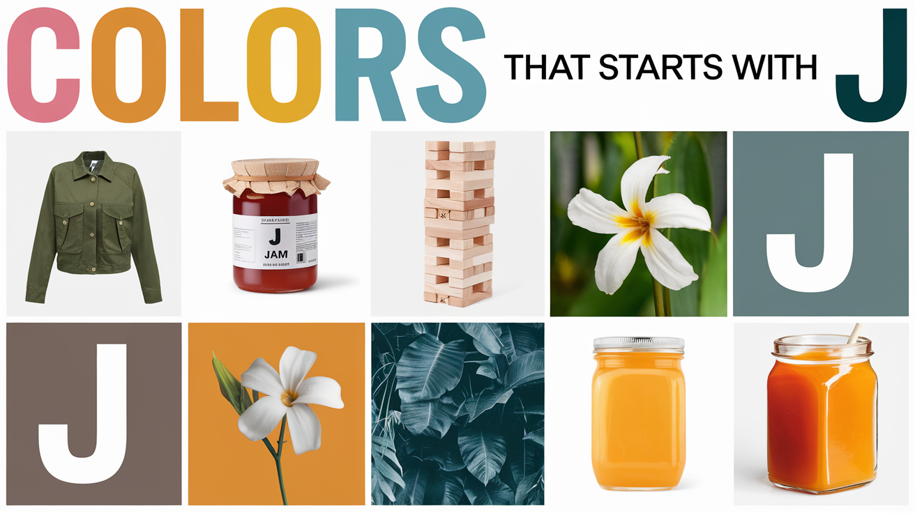
A Personalized List of Colors Starting with J – Journey Through Joyful Shades:
When it comes to choosing colors for your designs, understanding the emotional and natural significance of hues that start with J can be a game-changer. From vibrant shades that pop to subtle tones that soothe, J colors offer a versatile palette for creative projects. Below is a personalized list of some stunning colors starting with J that can inspire your next design or decor transformation. Whether you’re looking for something bold or calming, there’s a J color perfect for your needs!
Now, let’s explore our 10 captivating J colors:
Jewel of the Sea: The Mesmerizing Depth of Jade

Jade is a rich, deep green with a hint of blue, reminiscent of the precious stone it’s named after. It’s a color that manages to be both soothing and invigorating at the same time.
Picture this: Me, standing in the paint aisle, totally overwhelmed. Then, like a beacon of hope, there it was – Jade. I slapped it on my living room wall, and holy moly! It was like being hugged by Mother Nature herself. Now, every time I walk in, I feel like I’m in a lush forest (minus the bugs, thank goodness).
Jade’s Opulent Allure: Associations That Captivate and Soothe
- Emerald-like richness that adds depth and sophistication to any room
- Tropical forest-inspired serenity that promotes relaxation and harmony
- Precious gemstone elegance that brings a touch of luxury to interiors
- Lush green vitality that connects indoor spaces with nature
Joyful Sunrise: The Warm Radiance of Jonquil

Jonquil is a soft, buttery yellow that’s bright without being overwhelming. It’s named after the jonquil flower, a type of daffodil, and carries all the cheerfulness of a spring morning.
Jonquil, where have you been all my life? This cheery yellow is like a shot of espresso for your eyes. I painted my kitchen cabinets this color, and let me tell you, morning grumpiness is a thing of the past. It’s impossible to frown when you’re reaching for your cereal in a jonquil wonderland.
Jonquil’s Sunny Essence: Associations That Brighten and Uplift
- Daffodil-inspired cheerfulness that injects optimism into any space
- Soft yellow warmth that creates a welcoming, cozy atmosphere
- Spring-like freshness that symbolizes new beginnings and growth
- Gentle golden glow that adds a touch of subtle radiance to interiors
Juicy Delight: The Vibrant Energy of Jazzberry Jam

Jazzberry Jam is a vibrant, electric pink with a hint of purple. It’s bold, it’s daring, and it’s not afraid to make a statement. This color practically pulses with energy.
Alright, confession time. I once bought a jazzberry jam shirt on a whim, thinking, “Eh, why not?” Little did I know it would turn me into a walking conversation starter. This color is like the extrovert of the palette – it doesn’t know how to be quiet, and I’m here for it!
Jazzberry Jam’s Exuberant Spirit: Associations That Energize and Inspire
- Berry-toned vibrancy that injects life and enthusiasm into any room
- Bold pink-purple intensity that makes a strong, confident statement
- Playful fuchsia energy that stimulates creativity and conversation
- Rich, fruity hue that adds a touch of whimsy and joy to spaces
Jungle Mystery: The Deep Intrigue of Juniper

Juniper is a deep, muted blue-green that evokes the color of juniper berries. It’s a complex shade that can appear more blue or more green depending on the light, giving it a mysterious, changeable quality.
When I painted my home office juniper, I wasn’t expecting much. But holy productivity, Batman! This color is like a focus potion. I swear my brain works twice as fast surrounded by these deep, mysterious vibes. Who needs coffee when you’ve got juniper walls, am I right?
Juniper’s Enigmatic Charm: Associations That Ground and Inspire
- Forest-inspired depth that promotes concentration and calm
- Twilight blue-green serenity that encourages reflection and introspection
- Muted teal sophistication that adds a touch of mystery to interiors
- Natural, organic hue that connects indoor spaces with the outdoors
Jolly Festivity: The Classic Cheer of Jingle Bell Red

Jingle Bell Red is a bright, cheerful red with a slightly orange undertone. It’s warm and inviting, like the glow of holiday lights on a cold winter’s night.
I have this vintage armchair in jingle bell red, and it’s become the unofficial “happy seat” in our house. Feeling down? Park your butt in the red chair. It’s like a year-round dose of holiday cheer, minus the annoying carols.
Jingle Bell Red’s Festive Flair: Associations That Celebrate and Delight
- Holiday-inspired vibrancy that brings joy and excitement to spaces
- Classic red warmth that creates a welcoming, convivial atmosphere
- Energetic crimson intensity that stimulates conversation and activity
- Cheerful, attention-grabbing hue that serves as a lively accent color
Jasmine Dreams: The Delicate Beauty of Jasmine White

Jasmine White is a soft, creamy white with the faintest hint of yellow. It’s warm and inviting, evoking the delicate petals of a jasmine flower.
After a streak of sleepless nights, I decided to give jasmine white a shot in my bedroom. Let me tell you, it’s like sleeping in a cloud. I’m half convinced this color has magical sleep-inducing powers. If you see me yawning, you know why!
Jasmine White’s Ethereal Elegance: Associations That Soothe and Elevate
- Floral-inspired purity that adds a touch of natural elegance to any room
- Soft cream warmth that creates a cozy, inviting atmosphere
- Delicate off-white versatility that complements a wide range of decor styles
- Subtle yellow undertones that add a gentle, sunny glow to spaces
Jet-Set Sophistication: The Timeless Appeal of Jet Black

Jet Black is a deep, pure black with a slight sheen, reminiscent of the gemstone jet. It’s intense and dramatic, with an undeniable air of sophistication.
I used to think black walls were for moody teenagers or vampire lairs. Then I took the plunge and painted an accent wall jet black. Plot twist: it’s now the most sophisticated part of my house. It makes my art pop like it’s in a gallery. Who’s the cool grown-up now, huh?
Jet Black’s Dramatic Allure: Associations That Command Attention
- Intense, pure black depth that adds drama and sophistication to interiors
- Timeless, versatile darkness that creates striking contrasts in design
- Sleek, modern elegance that complements both traditional and contemporary styles
- Bold, confident hue that makes a powerful statement in any space
Joyful Oasis: The Refreshing Calm of Jacaranda

Jacaranda is a soft, dreamy purple-blue, inspired by the blossoms of the jacaranda tree. It’s a soothing, almost ethereal shade that sits somewhere between lavender and periwinkle.
Jacaranda in my guest bathroom was a total shot in the dark. Now it’s like a mini spa retreat. I catch guests taking suspiciously long “bathroom breaks.” Can’t blame them – I’d want to zen out in there too!
Jacaranda’s Tranquil Charm: Associations That Refresh and Relax
- Lavender-blue serenity that promotes relaxation and calm
- Floral-inspired softness that adds a touch of natural beauty to interiors
- Cool, soothing hue that creates a sense of spaciousness in small rooms
- Gentle purple-blue elegance that brings a touch of the outdoors inside
Java Warmth: The Cozy Comfort of Java Brown

Java Brown is a rich, deep brown with subtle reddish undertones, much like a cup of strong coffee. It’s warm and inviting, with a grounding quality that makes spaces feel cozy and intimate.
Painting my kitchen cabinets java brown was like giving my kitchen a warm hug. Now everyone lingers over coffee, and I’m pretty sure it’s not just my stellar conversation skills. This color just makes you want to stay a while, you know?
Java Brown’s Comforting Essence: Associations That Welcome and Embrace
- Coffee-inspired richness that adds depth and warmth to spaces
- Earthy brown coziness that creates a sense of comfort and security
- Rich, appetizing hue that’s perfect for kitchens and dining areas
- Versatile dark neutral that pairs well with a wide range of colors
Jovial Citrus: The Zesty Brightness of Juicy Orange

Juicy Orange is a vibrant, saturated orange that lives up to its name. It’s bright and energetic, like biting into a ripe tangerine on a hot summer day.
Those juicy orange curtains in my sunroom? Total game-changers. Even on the gloomiest days, it’s like the sun forgot to clock out. I’m convinced they’re the reason my plants are thriving. Coincidence? I think not!
Juicy Orange’s Vibrant Energy: Associations That Invigorate and Inspire
- Citrus-inspired brightness that injects optimism and vitality into rooms
- Warm, sunshiny glow that creates a cheerful, welcoming atmosphere
- Energetic, bold hue that stimulates creativity and conversation
- Appetizing, fresh color that’s perfect for kitchens and dining spaces
Jazzing Up Your Space: Tips for Incorporating J Colors
Now, I know what you’re thinking. “This all sounds great, but how do I actually use these colors without my place looking like a crayon factory exploded?” Fear not, my friend! Here are some nuggets of wisdom from my J-color journey:
- Start small: Maybe don’t go full jazzberry jam on all four walls. Try a throw pillow or a picture frame first.
- Mix and match: Jasmine white and java brown? A match made in heaven. Don’t be afraid to play color matchmaker.
- Let your personality shine: If you’re a jolly Jonquil, own it! If you’re more of a jaunty Jade, rock that vibe.
- Trust your gut: If a color makes you happy, go for it. Life’s too short for boring walls!
J Colors in Nature: Finding Inspiration in the Natural World
Many colors that begin with J are inspired by the beauty of the natural world. From the intricate details of plant life to the vibrant plumage of birds, nature offers a rich tapestry of hues that can fuel our artistic and design endeavors. Incorporating these colors allows us to bring elements of nature’s brilliance into our everyday surroundings.
You know what’s cool? Mother Nature was rocking these J-colors way before it was trendy. From the iridescent blue of a jay’s feathers to the soft white of jasmine petals, there’s a whole J-colored world out there just waiting to inspire us. Next time you’re out and about, keep your eyes peeled for these natural wonders. You might just find your next color crush!
- Jay Blue: Inspired by the striking feathers of the jay bird, this vibrant blue is perfect for injecting life and energy into any design, from logo creation to home accents.
- Jasmine White: Reflecting the purity and delicacy of jasmine flowers, this soft white is ideal for minimalist designs and creating a clean, fresh look in any room or workspace.
- Jaffa Orange: Named after the Jaffa orange, this bold hue brings warmth, vitality, and optimism. It’s a perfect choice for kitchens, living rooms, or anywhere you want to encourage positivity and creativity.
By drawing inspiration from these natural J colors, you can infuse your designs with an organic beauty that resonates on a deeper emotional level.
Wrapping It Up: The J-Color Revolution
So, there you have it – my whirlwind tour through the land of J-colors. From transforming my space to boosting my mood, these hues have been nothing short of revolutionary. The best part? This journey’s far from over. I’m still discovering new shades and finding fun ways to incorporate them into my life.
Now it’s your turn! Which J-color caught your eye? Are you ready to take the plunge and add some J-magic to your world? Remember, in the end, it’s all about what makes you happy. So go ahead, paint that wall, buy that shirt, or just doodle with a new color. Your J-color adventure awaits!
And hey, if you end up loving these colors as much as I do, don’t blame me if you find yourself obsessively pointing out J-colored things to your friends. It’s a delightful side effect, I promise!
More Color Names That Starts by Alphabet
Color Starter is your ultimate resource for expert insights and inspiration in color. We explore color theory, design trends, and the emotional impact of hues, providing practical tips to help designers and creators make informed color choices.