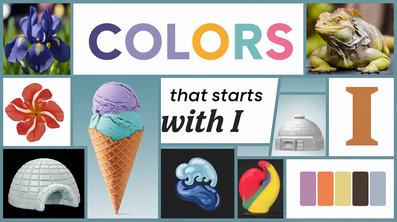
As a lifelong color enthusiast and interior design hobbyist, I’ve always been fascinated by the profound impact colors can have on our lives. They shape our moods, transform our spaces, and offer endless possibilities for self-expression. Recently, I found myself drawn to explore a often-overlooked segment of the color spectrum: hues that start with the letter I.
What began as a curious exploration quickly turned into a captivating journey of discovery. I uncovered a world of ‘I’ colors that range from intense and vibrant to subtle and sophisticated. Each shade seemed to tell its own story, evoking unique emotions and memories. For a deeper dive into more captivating shades, take a look at the list of colors from A to Z to find inspiration for your next design project.
In this blog post, I’m excited to share my personal encounters with 10 remarkable ‘I’ colors.
The Impact of I Colors: Understanding Their Psychological Effects
- Personal Connections: Think about your experiences with I colors. Do you associate a specific shade with cherished memories? Perhaps the bright Iris Purple reminds you of a joyful spring day spent in a garden. By recognizing these connections, you can curate a space that resonates with your personal journey.
- Emotional Resonance: Let’s take a moment to reflect on how colors beginning with I can influence our feelings and perceptions. For instance, the tranquil Indigo can evoke a sense of calm and introspection, making it ideal for spaces meant for relaxation, like a bedroom or reading nook. In contrast, Impulsive Red can ignite excitement and passion, perfect for vibrant gathering spaces.
- Choosing Wisely: Understanding the psychological effects of I colors empowers us to make informed decisions in our homes and designs. Picture walking into a room painted in a soothing Ice Blue—doesn’t it immediately feel refreshing? On the flip side, imagine a workspace featuring Ivy Green—a color that encourages creativity and productivity. Your choice of hue can transform a space and influence your daily mood and activities.
Enchanting List of Colors That Start with I
When it comes to colors that begin with the letter I, the options are as diverse as they are beautiful. These hues can range from soothing and serene to vibrant and invigorating, each offering a unique character and charm. Whether you’re looking to create a calming atmosphere or add a pop of color to your space, the following I colors provide inspiration for any design project. Here’s a closer look at some stunning shades:
Now, let’s explore our 10 captivating I colors:
Iridescent Illusion: The Mesmerizing Magic of Iris

Iris is a soft, ethereal purple that reminds me of the delicate petals of the flower it’s named after. I once used this color to paint an accent wall in my bedroom, and it transformed the space into a dreamy, tranquil sanctuary.
Iris’s Enchanting Aura: Associations That Transcend the Ordinary
- Lavender-tinged mystique that sparks imagination and creativity
- Floral-inspired elegance that adds a touch of sophisticated femininity
- Soft violet serenity that promotes relaxation and peaceful sleep
- Twilight-hued magic that bridges the gap between day and night
Icy Horizon: The Cool Clarity of Ice Blue

Ice Blue is a crisp, refreshing shade that evokes images of pristine glaciers and clear winter skies. When I incorporated this color into my home office through curtains and accessories, it instantly made the space feel more open and focused.
Ice Blue’s Crystalline Essence: Associations That Sharpen the Mind
- Glacier-inspired clarity that promotes clear thinking and concentration
- Frosty blue freshness that invigorates and energizes the space
- Cool, airy tint that creates a sense of expansiveness and possibility
- Wintry blue serenity that calms the mind and reduces stress
Ivory Tower: The Timeless Elegance of Ivory

Ivory is a warm, creamy off-white that exudes sophistication and timelessness. I used this color as the base for my living room, and it provided the perfect neutral backdrop for more colorful accents and artwork.
Ivory’s Classic Charm: Associations That Elevate Any Space
- Creamy white warmth that creates a welcoming, cozy atmosphere
- Antique-inspired elegance that adds a touch of vintage charm
- Soft, versatile neutrality that complements any design style
- Luxurious pearl-like sheen that brings a subtle glow to interiors
Invigorating Zest: The Energetic Burst of Icterine

Icterine is a vibrant, lemony yellow that instantly brightens any space. I have a set of icterine throw pillows that add a cheerful pop of color to my otherwise neutral sofa, instantly lifting the mood of the entire room.
Icterine’s Zesty Spirit: Associations That Spark Joy and Energy
- Citrusy yellow brightness that injects optimism and positivity
- Sunny, vibrant warmth that energizes and uplifts
- Bold, attention-grabbing hue that makes a strong statement
- Cheerful lemon-like freshness that stimulates creativity and conversation
Indigo Dreams: The Deep Mystery of Indigo

Indigo is a rich, deep blue with purple undertones that exudes mystery and depth. I painted my home library this color, and it created the perfect cozy, introspective atmosphere for reading and contemplation.
Indigo’s Profound Depth: Associations That Inspire Introspection
- Midnight blue intensity that promotes deep thinking and reflection
- Inky depth that adds a sense of mystery and sophistication
- Spiritual blue-purple that encourages meditation and inner peace
- Rich, royal hue that brings a touch of luxury to any space
Island Paradise: The Tropical Allure of Ironweed Purple

Ironweed Purple is a vibrant, reddish-purple inspired by the wildflower of the same name. I used this color for an accent wall in my sunroom, and it instantly transported the space to a tropical paradise.
Ironweed Purple’s Exotic Charm: Associations That Evoke Wanderlust
- Vivid floral purple that adds a touch of exotic beauty
- Tropical sunset-inspired hue that creates a sense of warmth and adventure
- Bold, attention-grabbing color that serves as a focal point in design
- Energetic reddish-purple that stimulates creativity and passion
Imperial Grandeur: The Regal Splendor of Imperial Red

Imperial Red is a deep, rich red that emanates power and luxury. I have a velvet armchair in this color, and it serves as a stunning statement piece in my living room, adding a touch of regal elegance.
Imperial Red’s Majestic Aura: Associations That Command Attention
- Regal crimson depth that exudes power and confidence
- Luxurious ruby-like richness that adds opulence to any space
- Passionate, intense red that stimulates energy and excitement
- Historic, imperial hue that connects to tradition and heritage
Iced Mocha: The Sophisticated Comfort of Irish Coffee

Irish Coffee is a warm, creamy brown with subtle golden undertones. I used this color for my kitchen cabinets, and it created a cozy, inviting atmosphere that makes everyone want to gather and linger over a cup of coffee.
Irish Coffee’s Comforting Warmth: Associations That Welcome and Soothe
- Rich, coffee-inspired brown that adds depth and warmth to spaces
- Creamy, golden-tinged hue that creates a sense of comfort and relaxation
- Sophisticated neutral that pairs well with both cool and warm colors
- Inviting, appetizing shade that’s perfect for dining and gathering areas
Iridescent Pearl: The Subtle Shimmer of Isabelline

Isabelline is a soft, pale gray-yellow that has a subtle, pearlescent quality. I used this color in my guest bathroom, and it added a gentle, luminous glow that made the small space feel more open and luxurious.
Isabelline’s Luminous Subtlety: Associations That Softly Illuminate
- Pearlescent pale yellow that adds a gentle, ethereal glow
- Soft, neutral warmth that creates a calming, serene atmosphere
- Versatile, light hue that opens up small spaces and reflects light beautifully
- Delicate, sophisticated shade that adds a touch of understated elegance
Ivy League: The Classic Charm of Ivy Green

Ivy Green is a deep, rich green inspired by the lush ivy that adorns prestigious university buildings. I painted my home office this color, and it instantly created an atmosphere of scholarly sophistication and natural tranquility.
Ivy Green’s Timeless Appeal: Associations That Ground and Inspire
- Deep forest green that connects interiors with nature
- Classic, academic-inspired hue that promotes focus and learning
- Rich, organic shade that adds depth and character to spaces
- Versatile, natural green that pairs well with both traditional and modern decor
I Colors in Nature: Drawing Inspiration from the World Around Us
- Nature’s Palette: Let’s explore how many I colors derive their beauty from the natural world around us. The stunning Iris, with its delicate petals, offers a range of captivating shades that can inspire everything from floral arrangements to wall colors. When you think of Ivory, do you envision the softness of clouds or the elegance of a swan gliding across a lake?
- Seasonal Inspiration: Notice how I colors reflect the changing seasons—Ice Blue can remind us of a serene winter landscape, while the rich Inca Gold evokes the warmth of autumn leaves. These colors serve as a reminder of the beauty in nature’s cycles and how they can be mirrored in our spaces.
- Bringing Nature Indoors: Consider how to infuse your living spaces with these I hues drawn from nature. Maybe a soft Ivy Green for your home office to foster creativity, or a vibrant Indian Red in your dining area to create an inviting atmosphere. Each I color offers a chance to bring a piece of the natural world into your home.
- Reflective Moments: Share your favorite I colors inspired by nature. How do they make you feel? Whether it’s the peaceful vibe of Island Blue or the energizing aura of Imperial Yellow, these colors can help us feel more connected to the world around us.
Incorporating I Colors: Tips for Using These Hues in Your Space
Now that we’ve explored these captivating I colors, you might be wondering how to use them effectively in your own designs or living spaces. Here are some tips:
- Use Ice Blue or Isabelline in bathrooms or small spaces to create an open, airy feel.
- Add pops of Icterine or Ironweed Purple to neutral spaces for an instant energy boost.
- Consider Ivory or Irish Coffee for larger living areas to create a warm, inviting backdrop.
- Experiment with Indigo or Imperial Red in creative or formal spaces to inspire depth and sophistication.
Illuminating Interiors: The Transformative Power of I Colors
Color has the remarkable ability to transform not just our spaces, but our moods and perceptions as well. From the calming depths of Indigo to the zesty brightness of Icterine, colors that start with I offer a diverse range of options for any design project or artistic endeavor.
As you consider incorporating these colors into your own spaces, remember that color is a deeply personal choice. Don’t be afraid to experiment and trust your instincts. You might be surprised at how a splash of Iris or a touch of Ivy Green can completely transform your environment and, by extension, your daily experience within it.
Which of these I colors speaks to you the most? How might you use them to illuminate your own living or working spaces? The palette of possibility is at your fingertips – let your imagination guide you as you explore the inspiring world of I colors!
Top Other Color NamesThat Starts by Alphabet

Elara Farrow is the Senior Content Strategist & Contributor at ColorStarter, where she harnesses her expertise in colour theory and design principles to create engaging materials for our audience. With a Master’s degree in Graphic Design from the Rhode Island School of Design, Elara has cultivated a deep understanding of how colour influences perception and emotion. Her journey in the design world began with a fascination for vibrant palettes.

