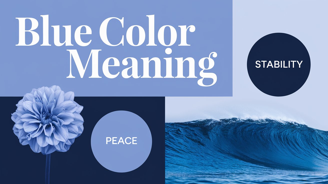
As I sit here gazing out my window at the vast azure sky, I’m reminded of the profound impact the color blue has on our lives. From the serene oceans to the endless heavens, blue surrounds us in nature, evoking a sense of tranquility and wonder. But blue’s influence extends far beyond the natural world, permeating our emotions, cultures, and daily experiences in ways both subtle and profound.
In my years as a color psychologist and design consultant, I’ve witnessed firsthand the power of blue to transform spaces, influence emotions, and shape perceptions. Join me as we dive deep into the fascinating world of blue, exploring its psychological effects, cultural significance, and practical applications in art, design, and beyond. To learn more about how colors influence our lives, check out this comprehensive guide on color meanings.
The Soothing Psychology of Blue: A Calm Oasis in a Chaotic World
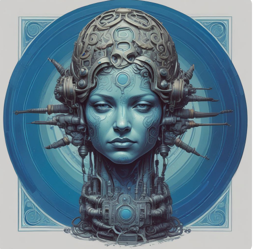
Blue has long been recognized for its calming properties, and there’s a scientific basis for this effect. In my practice, I’ve observed how exposure to blue can physically lower blood pressure and reduce heart rate, contributing to an overall sense of relaxation.
I recall a particularly stressed client who came to me for help redesigning her home office. By incorporating a soft, powdery blue on the walls and adding blue accents throughout the space, we created an environment that noticeably reduced her anxiety levels. She reported feeling more focused and less overwhelmed during her workday, a testament to blue’s ability to promote calm and clarity.
However, blue’s emotional associations aren’t always positive. The phrase “feeling blue” reflects the color’s connection to sadness and melancholy. In my work with color therapy, I’ve found that while blue can be incredibly soothing, an overabundance of dark or muted blues can sometimes exacerbate feelings of loneliness or depression.
The key lies in balance and context. When used thoughtfully, blue’s calming properties can far outweigh its potential downsides, creating spaces and experiences that promote relaxation, trust, and stability.
Blue Across Cultures: A Universal Symbol with Diverse Meanings

One of the most fascinating aspects of blue is how its symbolism varies across different cultures while maintaining certain core associations. In Western cultures, blue often represents trust, intelligence, and stability. This is why you’ll frequently see it used in corporate logos and official uniforms.
I once worked with a local police department to redesign their branding. By incorporating a deep, navy blue into their visual identity, we were able to reinforce their image of authority and trustworthiness within the community.
In Eastern cultures, blue takes on additional spiritual dimensions. During a trip to India, I was struck by the prevalence of blue in religious iconography, particularly in depictions of Krishna. The god’s blue skin is said to symbolize divine love and protection, adding layers of meaning to the color’s already rich symbolism.
Even in ancient Egypt, blue held special significance. It was associated with the sky god Horus and used in art and jewelry to represent divine protection. This ancient connection to the divine and the protective qualities of blue continue to influence its use in art and design today.
The Spectrum of Blue: From Serene Sky to Deep Ocean
Not all blues are created equal. Different shades of blue can evoke distinct emotions and associations. In my design work, I often use various blues to create specific atmospheres and emotional responses.
Light Blue: The Color of Open Skies and Clear Communication
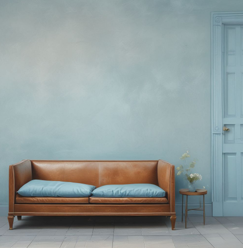
Light blue, reminiscent of a clear spring sky, often symbolizes peace, tranquility, and openness. I’ve found it particularly effective in spaces designed for communication and collaboration. In a recent project for a family counseling center, we used light blue in the waiting areas and therapy rooms to create an atmosphere of openness and trust, facilitating more honest and productive conversations.
Navy Blue: The Hue of Professionalism and Authority
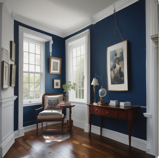
Navy blue, on the other hand, carries connotations of professionalism, authority, and intelligence. It’s a favorite in corporate environments and formal wear. I often recommend navy blue to clients looking to project confidence and competence in professional settings. One client, preparing for a series of important investor presentations, found that wearing a crisp navy suit helped him feel more self-assured and authoritative.
Turquoise and Aqua: The Colors of Creativity and Youth

The bluer greens, like turquoise and aqua, bridge the gap between blue’s calmness and green’s association with growth and renewal. These shades are linked to creativity, youthfulness, and refreshment. In a recent project for a startup’s office space, we used pops of turquoise to energize the environment and inspire innovative thinking among the young team.
Blue in Art and Design: From Picasso’s Melancholy to Modern Serenity
Blue’s impact on the art world cannot be overstated. Its ability to evoke emotion and create atmosphere has made it a favorite among artists throughout history. Perhaps most famously, Picasso’s Blue Period produced some of the most evocative and melancholic works in modern art history.
In my own artistic endeavors, I’ve found blue to be an incredibly versatile color. Whether used to create depth in a landscape or to set a contemplative mood in a portrait, blue has an unparalleled ability to speak to the viewer’s emotions.
In interior design, blue is a go-to color for creating spaces that feel stable, secure, and trustworthy. I often recommend blue for bedrooms, as it promotes relaxation and better sleep. In one memorable project, we transformed a client’s chaotic, cluttered bedroom into a serene blue sanctuary. The change not only improved the room’s aesthetics but also significantly enhanced the client’s sleep quality and overall well-being.
The Power of Blue in Branding and Marketing: Building Trust and Loyalty
In the world of branding and marketing, blue reigns supreme. Its associations with trust, reliability, and professionalism make it an ideal choice for companies looking to establish a strong, dependable image.
Think of some of the world’s most recognizable brands – Facebook, IBM, PayPal. What do they have in common? A strong blue visual identity. In my branding consultancy work, I’ve seen firsthand how incorporating blue into a company’s visual language can significantly impact consumer perception and trust.
One small tech startup I worked with was struggling to gain traction in a competitive market. By rebranding with a strong, confident blue, we were able to shift perceptions of the company from an unknown entity to a trustworthy, professional organization. The rebrand led to increased investor interest and customer engagement, demonstrating the tangible power of color in shaping business success.
Blue in Everyday Life: From Fashion to Home Decor

Blue’s versatility extends into our daily lives in countless ways. In fashion, blue is a perennial favorite, from the classic appeal of denim to the sophistication of a navy blazer. I often advise clients looking to build a versatile wardrobe to invest in key blue pieces, as they tend to be both timeless and widely flattering.
In home decor, blue can create a range of atmospheres depending on the shade and how it’s used. A pale blue can open up a small space and make it feel airy and light, while a deep blue accent wall can add drama and coziness to a larger room. In my own home, I’ve used a variety of blue tones to create a cohesive yet diverse feel throughout different spaces – from a serene light blue in the bedroom to a bold navy in the home office.
Frequently Asked Questions About the Color Blue
As a color psychologist, I’m often asked about the effects and meanings of blue. Here are some of the most common questions I encounter:
| Why is blue considered calming? Blue’s calming effect is deeply rooted in our connection to nature. The vast blue sky and the serene ocean both evoke feelings of tranquility and peace. Additionally, studies have shown that exposure to blue can physically lower heart rate and blood pressure, contributing to a sense of relaxation. |
| What does the color blue symbolize in business? In the business world, blue is often used to represent professionalism, trust, and dependability. Its non-confrontational nature makes it an ideal choice for companies looking to establish a reliable, trustworthy image. This is why you’ll often see blue used in the branding of financial institutions, healthcare providers, and technology companies. |
| How does blue affect mood? While blue is generally associated with calm and serenity, its effects on mood can be complex. In moderation, blue can promote relaxation and clear thinking. However, excessive exposure to certain shades of blue, particularly darker or more muted tones, can sometimes evoke feelings of sadness or melancholy. This is reflected in phrases like “feeling blue” to describe a low mood. |
Conclusion: The Enduring Impact of Blue
As we’ve explored, blue is far more than just a color – it’s a powerful force that shapes our emotions, our cultures, and our daily lives. From the calming blue of a clear sky to the trustworthy navy of a corporate logo, blue plays a significant role in how we perceive and interact with the world around us.
In my years of working with color, I’ve come to see blue as a sort of visual ambassador, bridging the gap between the natural world and our human-made environments. It has the unique ability to simultaneously soothe and inspire, to convey professionalism and evoke emotion.
As you move through your day, I encourage you to take notice of the blues around you. Observe how they make you feel, how they influence your perceptions and behaviors. You might be surprised at the subtle yet powerful ways this remarkable color touches your life.
Whether you’re designing a space, choosing an outfit, or building a brand, understanding the multifaceted meanings of blue can help you harness its power more effectively. In a world that often feels chaotic and unpredictable, the steady, calming presence of blue offers a welcome respite – a visual reminder of the vastness of the sky and the depths of the ocean, grounding us in something greater than ourselves.

Elara Farrow is the Senior Content Strategist & Contributor at ColorStarter, where she harnesses her expertise in colour theory and design principles to create engaging materials for our audience. With a Master’s degree in Graphic Design from the Rhode Island School of Design, Elara has cultivated a deep understanding of how colour influences perception and emotion. Her journey in the design world began with a fascination for vibrant palettes.
