Hey there, color enthusiasts! Ready to take a plunge into the cool, calming world of blue? Grab your favorite blue mug of tea (or coffee, I won’t judge), and let’s embark on an adventure through the various colors that start with b, including the stunning shades of blue. From the lightest sky blue to the deepest navy, we’re about to explore how these tones can transform our spaces, wardrobes, and even our moods. So, let’s dive in!
Why Blue? The Magic Behind Our Love Affair with Azure
Ever wondered why so many people claim blue as their favorite color? Well, it’s not just a coincidence. Blue has this incredible ability to speak to our emotions in ways that other colors just can’t match. It’s like that reliable friend who’s always there to lend an ear and offer a comforting hug. Whether you’re thinking about the blue color meaning or how it transforms spaces, it consistently evokes feelings of calm and serenity.
I remember repainting my home office during the pandemic. After trying out what felt like a million color swatches, I settled on a soft blue. The result? My stress levels dropped, and my creativity soared. It was like working in my own personal oasis of calm.
Blue isn’t just easy on the eyes; it’s a mood-lifter too. Studies have shown that blue environments can boost productivity and enhance focus. No wonder tech giants like Facebook and Twitter chose blue for their branding!
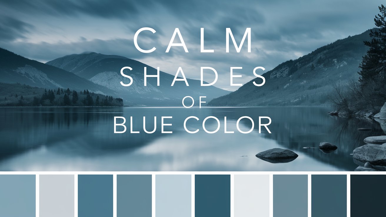
Rainbow of Different Shades of Blues: Exploring the Spectrum
Blue isn’t just one color—it’s a vast spectrum of shades, each with its own unique character and appeal. From the calming tones of sky blue to the regal depth of navy, each shade of blue brings its own unique energy to a space or design. Whether you’re looking to create a serene bedroom retreat with powder blue walls or make a bold statement with a cobalt blue accent, the shades of colors have endless possibilities.
From the calming tones of sky blue to the regal depth of navy, each shade of blue brings its own unique energy to a space or design. Whether you’re looking to create a serene bedroom retreat with powder blue walls, make a bold statement with a cobalt blue accent piece, or add a touch of mystery with midnight blue accessories, there’s a shade of blue perfect for every mood and occasion.
Remember, these codes are your key to perfectly matching colors across different mediums, from digital designs to home decor. So don’t be afraid to experiment with different shades and combinations – the world of blue is vast and full of possibilities!
Here’s a list of different shades of blue, along with their RGB, CMYK, and HEX codes:
Sky Blue: Bringing the Outdoors In

Remember that feeling of lying on your back, gazing up at a clear summer sky? That’s the essence of sky blue. It’s that perfect shade that makes you feel like you’re floating on a cloud, even when you’re stuck indoors.
I once helped a friend decorate her newborn’s nursery in sky blue. The result was magical – it was like the baby had his own piece of heaven. The room felt larger, brighter, and incredibly serene. Pro tip: Pair sky blue with soft whites or pale yellows for a dreamy, cloud-like effect.
Sky Blue Color RGB, CMYK & HEX Code
RGB: 135, 206, 235
CMYK: 42, 12, 0, 8
HEX: #87CEEB
Powder Blue: The Vintage Charm

Ah, powder blue – the color that takes you straight back to grandma’s china collection. There’s something inherently nostalgic about this shade. It’s soft, it’s subtle, and it’s got that vintage charm that never goes out of style.
I recently spotted a powder blue vintage car at a classic auto show. Let me tell you, it was a head-turner! This shade has a way of making everything look effortlessly elegant. Try incorporating powder blue accents in your living room for a touch of timeless sophistication.
Powder Blue Color RGB, CMYK & HEX Code
RGB: 176, 224, 230
CMYK: 23, 3, 0, 10
HEX: #B0E0E6
Bold Blues: Making a Statement
When you want to turn heads and make an impression, bold blues are your go-to shades. We’ll examine the vibrant world of cobalt and royal blue, discovering how these intense hues can energize your space and wardrobe. Just like different shades of red color make a strong impact, bold blues bring excitement and energy into any room or outfit.
Cobalt Blue: The Artist’s Muse

If blue had a rock star, it would be cobalt. This vibrant, intense shade has been captivating artists for centuries. Remember Vermeer’s “Girl with a Pearl Earring”? That striking blue headscarf? Yep, that’s cobalt blue working its magic.
I once wore a cobalt blue dress to a friend’s wedding. Not only did I feel like a million bucks, but I also got compliments all night long. There’s something about this shade that demands attention without being overpowering. If you’re feeling bold, why not try a cobalt blue accent wall in your living room? Trust me, it’ll be a conversation starter!
Cobalt Blue Color RGB, CMYK & HEX Code
RGB: 0, 71, 171
CMYK: 100, 58, 0, 33
HEX: #0047AB
Royal Blue: Fit for a King (or Queen)

As the name suggests, royal blue exudes regality and confidence. It’s the color of sapphires, of clear night skies, and of power suits in boardrooms across the world.
I have a royal blue blazer that I call my “power jacket.” Whenever I wear it to important meetings, I feel like I can conquer the world. It’s amazing how a simple color can boost your confidence so much. Consider adding some royal blue to your wardrobe – it might just be the secret weapon you need to nail that job interview or ace that presentation.
Royal Blue Color RGB, CMYK & HEX Code
RGB: 65, 105, 225
CMYK: 71, 53, 0, 12
HEX: #4169E1
Deep Blues: Diving into the Depths
For those who crave sophistication and mystery, deep blues offer a world of possibilities. We’ll plunge into the rich tones of navy and midnight blue, uncovering their potential to add depth and elegance to any design.
Navy Blue: The Timeless Classic

Navy blue is like that trusty pair of jeans you’ve had forever – it goes with everything, it’s always in style, and it makes you feel put-together no matter what. This deep, rich shade has been a staple in fashion and design for centuries, and for good reason.
I recently redecorated my bedroom with navy blue walls, and let me tell you, it’s like sleeping in a cozy cocoon every night. Paired with crisp white linens and some gold accents, it feels luxurious without being over the top. If you’re hesitant about going too bold with color, navy is your safe bet – it’s dramatic yet classic.
Navy Blue Color RGB, CMYK & HEX Code
RGB: 0, 0, 128
CMYK: 100, 100, 0, 50
HEX: #000080
Midnight Blue: The Mysterious Allure

Midnight blue is that enigmatic shade that sits right on the edge between blue and black. It’s mysterious, it’s sexy, and it’s got depth for days.
I once attended a gala where the theme was “Midnight in Paris.” The venue was decked out in midnight blue drapes and twinkling lights, creating an atmosphere that was nothing short of magical. This shade has a way of making everything feel a bit more glamorous. Try using midnight blue in small doses – a throw pillow here, a piece of art there – to add some intrigue to your space.
Midnight Blue Color RGB, CMYK & HEX Code
RGB: 25, 25, 112
CMYK: 78, 78, 0, 56
HEX: #191970
Even More Blues: Exploring the Spectrum
Blue isn’t limited to just one shade; it offers a wide array of tones, each evoking its own mood and aesthetic. From soft pastels to deep, bold hues, blue has the versatility to create everything from calm and serene environments to striking, energetic spaces. Let’s dive into the full spectrum of blue and discover how each shade can bring a different vibe to your designs and surroundings.
Cerulean Blue: The Sky’s the Limit

Cerulean is like a perfect summer day captured in a color. It’s brighter than navy but deeper than sky blue. This vibrant, saturated blue reminds me of clear Mediterranean waters. I once saw a cerulean blue vintage Vespa scooter, and it instantly transported me to the Amalfi Coast!
Cerulean Color RGB, CMYK & HEX Code
RGB: 0, 123, 167
CMYK: 100, 26, 0, 35
HEX: #007BA7
Turquoise: Where Blue Meets Green

Turquoise is that perfect blend of blue and green that makes you think of tropical lagoons and mermaid tails. It’s energetic yet soothing. I have a turquoise statement necklace that never fails to brighten up a simple outfit and my mood!
Turquoise Color RGB, CMYK & HEX Code
RGB: 64, 224, 208
CMYK: 71, 0, 7, 12
HEX: #40E0D0
Indigo: The Mystic Blue

Indigo is the color of intuition and perception. It’s a deep, rich blue with a hint of purple. Think of the sky just as twilight sets in. I once painted an accent wall in my meditation room indigo – it created such a serene, introspective atmosphere.
Indigo Color RGB, CMYK & HEX Code
RGB: 75, 0, 130
CMYK: 42, 100, 0, 49
HEX: #4B0082
Periwinkle: The Playful Pastel

Periwinkle is a light, whimsical shade that sits between blue and purple. It’s like the color of a daydream. I have a periwinkle sweater that always gets compliments – it’s soft, feminine, and unexpectedly versatile.
Periwinkle Color RGB, CMYK & HEX Code
RGB: 204, 204, 255
CMYK: 20, 20, 0, 0
HEX: #CCCCFF
Teal: The Sophisticated Blue-Green

Teal is a deep blue-green that exudes confidence and sophistication. It’s bold without being overpowering. I once saw a kitchen with teal cabinets, and it was surprisingly chic and inviting. It’s become my go-to color for adding a pop of color to neutral spaces.
Teal Color RGB, CMYK & HEX Code
RGB: 0, 128, 128
CMYK: 100, 0, 0, 50
HEX: #008080
Azure: The Digital Blue

Azure is a bright, cyanic blue that’s often associated with the digital world (think Microsoft Azure). It’s vibrant and attention-grabbing. I use an azure blue for hyperlinks on my personal website – it stands out beautifully against a white background.
Azure Color RGB, CMYK & HEX Code
RGB: 0, 127, 255
CMYK: 100, 50, 0, 0
HEX: #007FFF
Incorporating These New Blues
With these additional shades, our blue palette has expanded significantly. Each of these blues has its own personality and can be used to create different moods and effects:
- Cerulean is great for creating a fresh, airy feel in a room. Try it in a bathroom or sunroom.
- Turquoise works wonderfully as an accent color. Think throw pillows, vases, or even a bold front door.
- Indigo can add depth and mystery to a space. It’s perfect for a reading nook or a cozy den.
- Periwinkle is ideal for nurseries or playrooms. It’s gentle but still fun and engaging.
- Teal is sophisticated enough for a home office but playful enough for a creative space.
- Azure can add a modern, tech-savvy touch to any room. It’s great for home offices or gaming rooms.
Remember, you don’t have to limit yourself to just one shade of blue. Try combining different blues for a monochromatic look, or pair them with complementary colors for more contrast. For example, cerulean and coral make a beautiful, beachy combination, while indigo and mustard yellow create a rich, regal palette.
Whether you’re painting a room, designing a website, or putting together an outfit, these expanded options give you even more ways to incorporate the calming, versatile power of blue into your life. So go ahead, experiment with these shades and find your perfect blue!
Mixing and Matching: Blue’s Best Friends
Blue plays well with others, and in this section, we’ll explore how to pair different shades of blue with other colors for stunning combinations. One of the best things about blue is how well it complements different hues in color combinations. Light blues look fantastic with soft pinks for a pastel paradise, while bold blues pair beautifully with oranges and yellows.
Light blues look fantastic with soft pinks for a pastel paradise, or with crisp whites for a fresh, clean look. Bold blues like cobalt pair beautifully with sunny yellows or vibrant oranges for a high-energy combo. And deep blues? They’re practically made for metallic accents – think gold, silver, or rose gold.
In my own wardrobe, I love pairing a navy blue blazer with a crisp white shirt and burgundy accessories. It’s a combination that never fails to make me feel put-together and stylish.
Blue in the Wild: Unexpected Places You’ll Find Azure
Blue isn’t just for your walls or wardrobe – it’s everywhere in nature too! From the iridescent wings of a Morpho butterfly to the striking plumage of a Blue Jay, Mother Nature clearly loves this hue as much as we do. The blue color psychology explains why we naturally gravitate towards blue, whether it’s in art, fashion, or even nature itself.
And let’s not forget about blue in food! Blueberries, blue corn, and even blue potatoes bring a pop of unexpected color to our plates. I once made a salad with blue cheese, blueberries, and blue corn tortilla strips – it was a hit at the potluck and looked as good as it tasted!
Feeling Blue? Fun Facts to Brighten Your Day
Did you know that blue is the world’s favorite color? A global survey found that blue tops the charts in countries around the world. It seems our love for azure knows no borders! Understanding color psychology can help explain why people are drawn to blue and other hues, affecting moods and emotions worldwide.
Here’s another cool tidbit: the phrase “feeling blue” actually comes from nautical tradition. If a ship lost its captain during a voyage, it would fly blue flags and paint a blue band along its hull when returning to port.
And for all you art lovers out there, have you heard of International Klein Blue? It’s a deep blue hue developed by French artist Yves Klein. He was so obsessed with this particular shade that he patented it!
Your Burning Blue Questions, Answered!
| What’s the most calming shade of blue? While it can vary from person to person, many find light blues like sky blue or powder blue to be the most soothing. These shades remind us of clear skies and calm waters, naturally promoting relaxation. |
| How can I incorporate blue into my home without painting the walls? Great question! Try adding blue through accessories like throw pillows, curtains, or area rugs. You can also bring in blue through artwork or even plants with blue-tinted foliage like the Blue Star Fern. |
| Is it true that blue suppresses appetite? There’s some evidence to suggest that blue might be an appetite suppressant, which is why you don’t see many blue foods in nature. However, this doesn’t mean you should paint your kitchen blue to lose weight – the effect is subtle at best! |
Wrapping Up Our Blue Adventure
Well, friends, we’ve journeyed through the vast ocean of blue, from the lightest sky to the deepest navy. We’ve explored how these shades can transform our spaces, boost our moods, and even influence our behavior.
Whether you’re a fan of serene sky blue, bold cobalt, or mysterious midnight, there’s a shade of blue out there for everyone. So why not bring a little azure into your life? Paint an accent wall, buy a blue throw pillow, or simply gaze up at the sky for a moment. After all, in a world that can sometimes feel chaotic, we could all use a touch of blue’s calming, inspiring energy.
Remember, the world is your canvas, and blue is just one of the many colors at your disposal. So go forth and paint your world in whatever shades make you happy. And who knows? Maybe next time we’ll dive into the sunny world of yellow or the passionate realm of red. Until then, keep calm and blue on!

Elara Farrow is the Senior Content Strategist & Contributor at ColorStarter, where she harnesses her expertise in colour theory and design principles to create engaging materials for our audience. With a Master’s degree in Graphic Design from the Rhode Island School of Design, Elara has cultivated a deep understanding of how colour influences perception and emotion. Her journey in the design world began with a fascination for vibrant palettes.