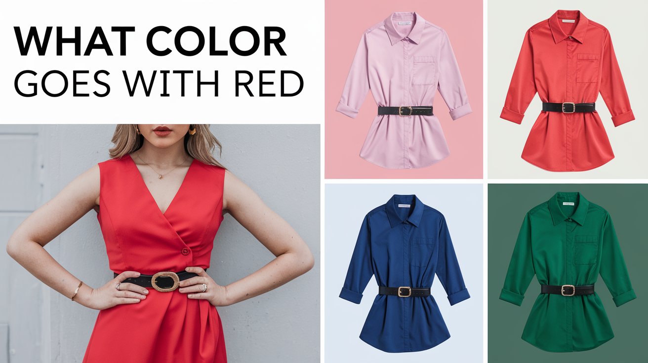
Red – the color of passion, energy, and confidence – has been captivating humans for centuries. From the rich crimson of a sunset to the vibrant scarlet of a cardinal, red demands attention and evokes strong emotions. But when it comes to incorporating this powerful hue into our homes, wardrobes, or designs, many of us find ourselves asking: what colors go with red?
As an interior designer with over a decade of experience, I’ve had my fair share of clients who were both excited and intimidated by the prospect of using red in their spaces. I remember one particularly memorable project where a young couple wanted to infuse their new home with energy but were unsure how to balance red’s intensity. Through careful color pairing and strategic placement, we transformed their living room into a warm, inviting space that exuded both sophistication and comfort. The key? Understanding how to pair red with complementary and contrasting colors.
In this article, we’ll explore a variety of stunning color combinations that work harmoniously with red. Whether you’re looking to revamp your living room, update your wardrobe, or add a pop of color to your design project, you’ll find inspiration and practical advice to make red work for you.
Why Red is Such a Bold Choice
Before we dive into color pairings, it’s important to understand why red is such a powerful color choice. Psychologically, red is associated with energy, passion, and excitement. It’s the color of love and danger, which makes it inherently attention-grabbing.
I once worked with a restaurant owner who wanted to increase customer turnover. We painted one wall of the dining area a deep, rich red. The result? Not only did the space feel more vibrant and energetic, but we noticed that customers tended to eat more quickly and leave sooner – exactly what the owner wanted!
Different shades of red can evoke various emotions:
- Scarlet: vibrant and energetic
- Ruby: rich and luxurious
- Crimson: deep and passionate
- Burgundy: sophisticated and mature
When choosing a red for your space or outfit, consider the mood you want to create. A bright cherry red might be perfect for a playful kitchen, while a deeper maroon could work beautifully in a formal dining room.
Complementary Color Palettes for Red
When pairing red with complementary colors, the goal is to create a balanced and harmonious look. Complementary colors often sit opposite each other on the color wheel, offering a pleasing contrast while maintaining visual harmony. White, beige, and black are timeless choices that allow red to pop without overwhelming a space or outfit. These combinations are ideal for creating sleek, elegant interiors or classic fashion statements that draw attention while remaining cohesive
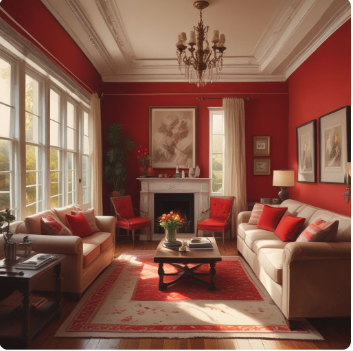
Red and White: Clean and Classic
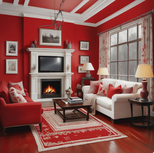
The combination of red and white creates a crisp, modern look that never goes out of style. I once designed a minimalist kitchen where we painted the cabinetry a glossy white and added a bold red backsplash. The result was stunning – clean and fresh, yet with a punch of personality.
This pairing works equally well in fashion. Think of a crisp white shirt paired with red trousers for a look that’s both professional and eye-catching.
Best Uses: Kitchens, modern living rooms, casual outfits
Red and Black: Dramatic Elegance
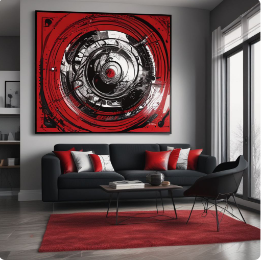
For those who want to make a statement, the combination of red and black is hard to beat. This pairing exudes sophistication and drama. I recently worked on a formal living room where we used a deep red velvet sofa against a black accent wall. The effect was nothing short of theatrical – perfect for my client who loved to entertain.
In fashion, a red dress with black accessories is a classic choice for formal events, always guaranteed to turn heads.
Best Uses: High-fashion, moody interiors, formal living rooms
Red and Beige: Subtle Warmth
If you’re looking to incorporate red without overwhelming a space, pairing it with beige is an excellent choice. The neutral tones of beige soften red’s intensity, creating a warm and inviting atmosphere.
I once designed a bedroom where we used beige as the primary color for walls and bedding, then added red accents through throw pillows, artwork, and a cozy reading chair. The result was a serene space with just the right amount of energy.
Best Uses: Bedrooms, office decor, cozy reading nooks
Contrasting Colors for a Dynamic Look
For those seeking bold and energetic design choices, contrasting colors with red bring an eye-catching, vibrant feel. Pairing red with cooler tones like teal, navy, or light blue creates a dynamic contrast, adding excitement and depth to a room or wardrobe. These combinations work well for modern, playful designs where the goal is to stand out and make a strong visual impact.
Red and Teal: Energetic and Vibrant
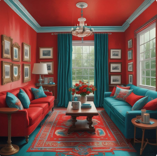
For those who aren’t afraid of color, the combination of red and teal is a show-stopper. This pairing is lively, modern, and perfect for making a statement. In a recent project, we painted a kitchen island teal and paired it with red bar stools. The result was a kitchen that felt fresh, fun, and full of personality.
This color combination also works wonderfully in fashion. A teal dress with red accessories can create a bold, eye-catching outfit that’s perfect for summer events.
Best Uses: Accent walls, kitchen decor, trendy outfit pairings
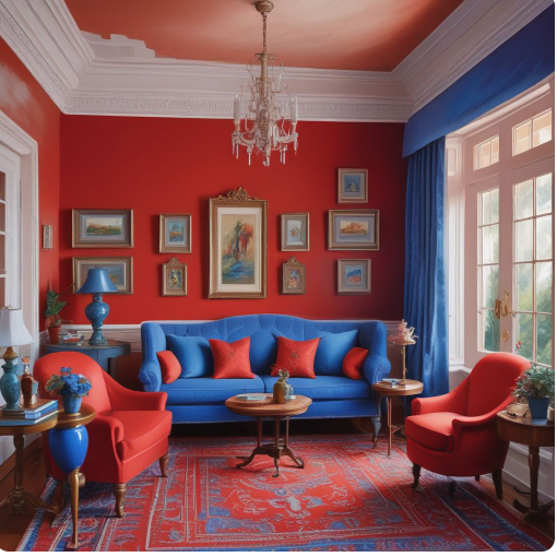
Red and Navy: Classic and Timeless
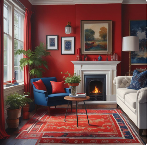
Red and navy is a color combination that stands the test of time. It’s often associated with nautical themes, but its applications go far beyond that. I once designed a home office where we used navy blue for the walls and incorporated red through the desk chair and accessories. The space felt professional and focused, yet still warm and inviting.
In fashion, a navy suit with a red tie is a classic choice for business attire, exuding confidence and professionalism.
Best Uses: Living rooms, formal dining rooms, professional attire
Red and Green: Refreshing and Festive
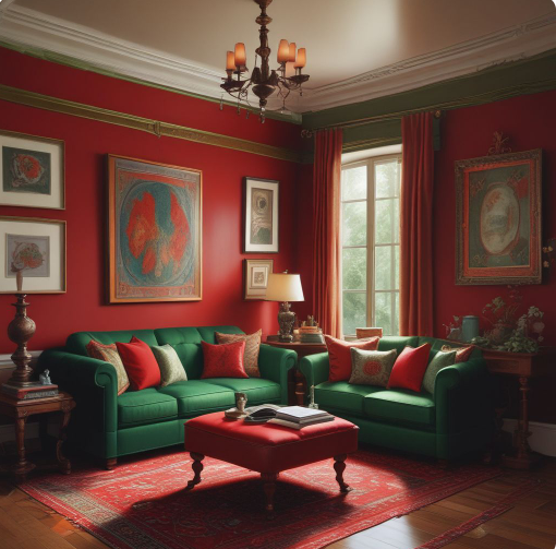
While red and green might immediately bring Christmas to mind, this combination can work year-round when done correctly. The key is to choose the right shades. For example, pairing a deep red with an olive green creates a sophisticated, earthy look.
I once designed a sunroom where we used olive green for the walls and incorporated red through floral patterns in the upholstery and curtains. The space felt like a lush garden retreat, perfect for relaxing with a book or enjoying morning coffee. For more ideas on green pairings, explore what color goes with green to discover additional complementary color options.
Best Uses: Holiday decor, modern interiors, garden settings
Unconventional Pairings with Red
Unconventional color pairings with red involve creative and unexpected combinations that defy traditional color rules. Think of colors like periwinkle, gold, or even green. These pairings can make a space or outfit feel unique, luxurious, or whimsical, depending on the tones used. Such combinations are ideal for those looking to experiment with design, adding flair and personality to their decor or style.
Red and Periwinkle: Soft and Playful
For a more unexpected pairing, consider red and periwinkle. This combination brings out the softer side of red, creating a look that’s both playful and sophisticated. In a recent children’s room design, we used periwinkle for the walls and incorporated red through bedding and toys. The result was a cheerful, gender-neutral space that could easily grow with the child.
This color combination can also work well in fashion, particularly for spring and summer looks. A periwinkle dress with red accessories creates a fresh, feminine outfit.
Best Uses: Children’s rooms, casual clothing
Red and Gold: Luxurious and Royal
For those who want to create a sense of opulence, the combination of red and gold is hard to beat. This pairing exudes luxury and sophistication. I once designed a formal dining room where we used a deep red wallpaper with a subtle gold pattern. Paired with gold-framed mirrors and candlesticks, the space felt fit for royalty.
In fashion, red and gold are often seen in traditional cultural attire and are perfect for creating show-stopping formal wear.
Best Uses: Dining rooms, formal wear, traditional decor
Tips for Pairing Red with Other Colors
- Mix textures: Combining different textures can enhance the effect of color pairings. For example, in a red and white room, you might use a plush red velvet sofa against crisp white walls, or pair a smooth red leather chair with a textured white throw.
- Balance the intensity: Red is a strong color, so it’s important to use it judiciously, especially in smaller spaces. In a compact room, consider using red as an accent color rather than the dominant shade. For example, in a small bathroom, you might use white tiles with a few red accent tiles for a pop of color.
- Accent with metallics: Adding metallic accents can elevate any color scheme involving red. In a red and black room, gold accessories can add a touch of glamour. In a red and navy space, silver accents can enhance the crisp, clean look.
- Consider lighting: Remember that lighting can significantly affect how red appears in a space. Natural daylight will bring out the true color of red, while artificial lighting can alter its appearance. Always test your chosen red under different lighting conditions before committing to it.
- Use patterns: Incorporating patterns is a great way to introduce red into a space or outfit without it being overwhelming. A rug with a red pattern or a shirt with red stripes can add interest without dominating the overall look.
Frequently Asked Questions
| Does red go with grey? Absolutely! Grey, especially in lighter shades, pairs beautifully with red. This combination creates a modern, sophisticated look. For example, a grey sofa with red throw pillows can create a stylish and contemporary living room. |
| Can I pair red with pastel colors? Yes, red can work well with pastel colors when used thoughtfully. Pastels like blush pink, sky blue, and lavender can soften the intensity of red, creating a more serene vibe. In a bedroom, for instance, you might use blush pink walls with red accent pieces for a romantic, feminine look. |
| What are some bold color combinations with red for fashion? For those who love to make a statement with their wardrobe, try pairing red with cobalt blue or hot pink. A red blazer over a cobalt blue dress, or red shoes with a hot pink outfit, can create high-impact, trend-setting looks. |
Conclusion
In conclusion, red is a versatile color that can work in a variety of settings and combinations. Whether you prefer classic pairings like red and white, or more unconventional choices like red and periwinkle, there’s a red color combination out there for every style and preference.
Remember, the key to successfully incorporating red into your space or wardrobe is balance and confidence. Don’t be afraid to experiment and find the combination that speaks to you. After all, in the world of design and fashion, rules are meant to be broken, and personal style always trumps trends. So go ahead, embrace the power of red, and let your creativity shine!

Elara Farrow is the Senior Content Strategist & Contributor at ColorStarter, where she harnesses her expertise in colour theory and design principles to create engaging materials for our audience. With a Master’s degree in Graphic Design from the Rhode Island School of Design, Elara has cultivated a deep understanding of how colour influences perception and emotion. Her journey in the design world began with a fascination for vibrant palettes.