Have you ever found yourself in a creative rut, searching for that perfect color to bring your project to life? Well, you’re in for a treat as we dive into the fascinating world of colors that start with the letter F. From the vibrant energy of Fuchsia to the earthy elegance of Fawn, these hues offer a diverse palette that can transform any design from ordinary to extraordinary.
As a seasoned interior designer, I’ve witnessed firsthand the transformative power of color. I recall a client who was hesitant to step outside her comfort zone of neutrals. When I suggested incorporating Fuchsia accents in her living room, she was skeptical. But once we added some bold throw pillows and a striking piece of artwork, the space came alive with energy and personality. That’s the magic of exploring beyond the usual color suspects!
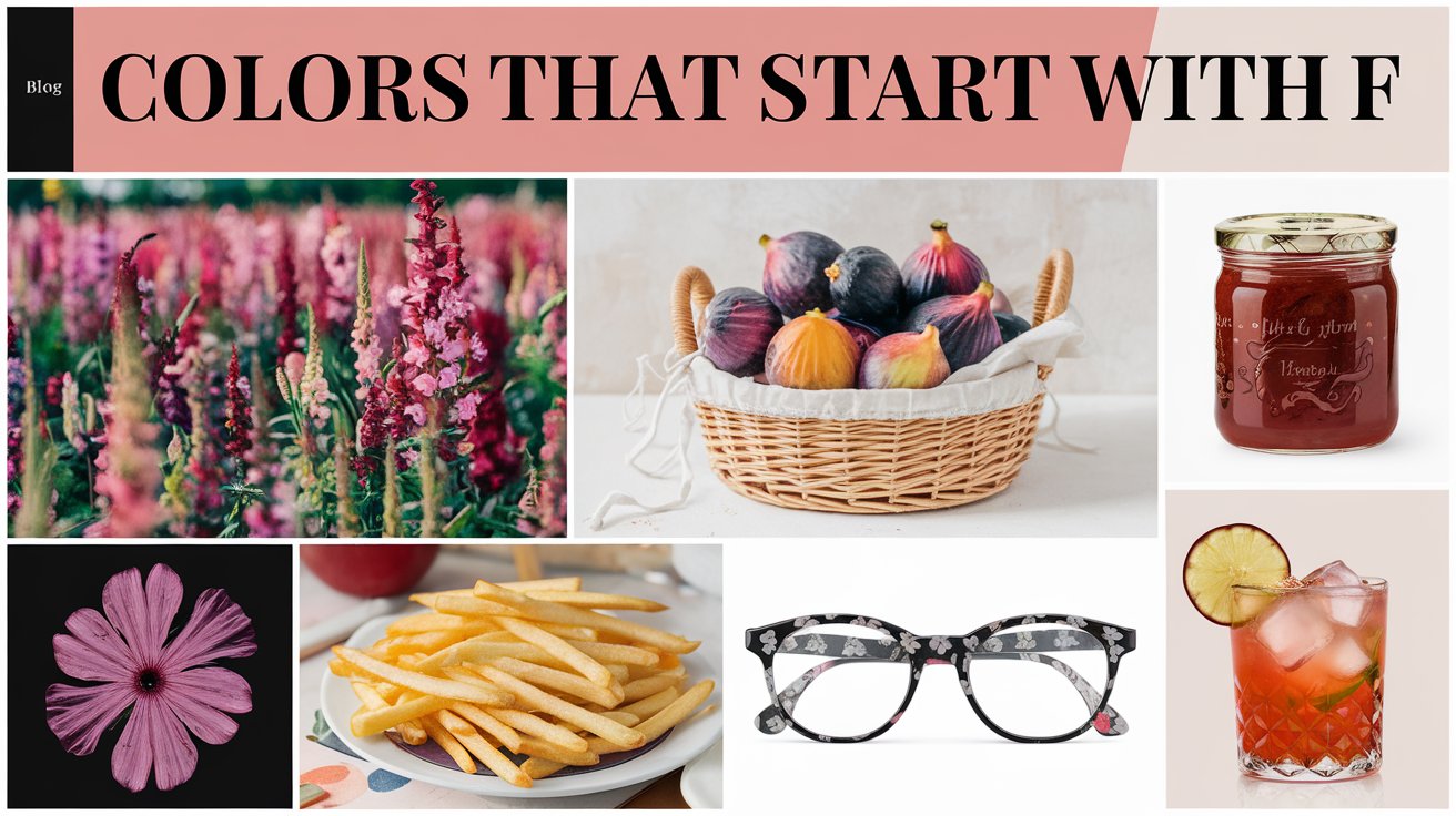
In this article, we’ll explore ten captivating colors that begin with F, delving into their meanings, applications, and the unique flair they can bring to your designs. Whether you’re a fashion enthusiast, an interior decorator, or simply someone who appreciates the beauty of color, you’re in for an inspiring journey. Let’s paint the town… well, F!
The Spectrum of F Colors: From Vibrant to Subtle
When we think of colors starting with F, we’re met with a surprisingly diverse spectrum. On one end, we have the bold and brilliant hues like Fuchsia and Flame, colors that demand attention and exude energy. On the other, we find the more subdued tones like Fawn and Field Drab, which offer a sense of calm and groundedness.
This range allows for incredible versatility in design. For instance, I once worked on a boutique hotel lobby where we used a gradient of F colors. We started with a Fuchsia accent wall that gradually transitioned to Flamingo Pink, then to Fawn, creating a stunning ombre effect that guests couldn’t stop talking about. For more inspiration, check out this colors list from A to Z to explore the full range of hues for your next project.
The Psychology of F Colors: What They Communicate
Colors have a profound impact on our emotions and behaviors, and the F palette is no exception. Fuchsia and Ferrari Red, for example, are often associated with passion, energy, and confidence. I’ve used these colors in home offices to create a space that fosters creativity and motivation.
On the other hand, colors like Forest Green and Fern Green evoke feelings of growth, harmony, and connection to nature. In a recent project, I incorporated these shades in a meditation room, creating a serene environment that immediately put clients at ease.
Understanding the psychological impact of these colors can help you make informed choices in your designs, whether you’re creating a brand identity or decorating a living space.
F Colors in Nature: Inspiration from the World Around Us
Nature is an endless source of color inspiration, and many of our F colors have direct links to the natural world. Forest Green and Fern Green, obviously, take their cues from lush vegetation. Flamingo Pink reminds us of the elegant birds that inspired its name.
Even the more unusual colors have natural counterparts. Fawn, for instance, mimics the soft coat of a young deer. I once used this color in a nursery design, paired with woodland-themed decor, to create a cozy and whimsical space for a nature-loving family.
By drawing inspiration from nature, we can create color palettes that feel harmonious and grounded, even when using bolder shades.
Comprehensive List of F Colors: From Fawn to Fuchsia
Explore a diverse spectrum of hues that begin with the letter F. From vibrant tones like Fuchsia and Flame to more subtle shades such as Fawn and Feldgrau, this list showcases the rich variety of colors in the ‘F’ category. Whether you’re a designer seeking inspiration or simply a color enthusiast, this alphabetical collection offers a quick glimpse into the world of F-starting colors, demonstrating the wide range of options available for your creative projects.
Fuchsia

Fuchsia is the life of the color party! This vivid pinkish-purple hue (HEX #FF00FF) is impossible to ignore, making it perfect for designs that aim to make a statement.
In my design career, I’ve found Fuchsia to be a game-changer in spaces that need a jolt of energy. I once used it to transform a dull guest bedroom into a vibrant retreat. We painted one wall Fuchsia and kept the rest neutral, then added Fuchsia-patterned curtains and a plush area rug. The result was a room that exuded personality and warmth.
In the fashion world, Fuchsia is a favorite for statement pieces. Whether it’s a bold handbag, a pair of shoes, or even a full outfit, Fuchsia demands attention and exudes confidence.
Fawn

Shifting gears from bold to subtle, we have Fawn. This soft, warm light brown (HEX #E5AA70) is like a visual comfort food, evoking feelings of coziness and earthiness.
I love using Fawn in interior design to create inviting, grounded spaces. In a recent project, I painted a home library in Fawn and paired it with rich leather furniture and warm wood accents. The result was a room that felt like a warm embrace, perfect for curling up with a good book.
Fawn is also an excellent choice for those looking to incorporate more color into their wardrobe without going too bold. Its neutrality makes it versatile, while its warmth adds depth that you won’t get from basic beige or gray.
Forest Green

Close your eyes and imagine walking through a lush, dense forest. That deep, rich green surrounding you? That’s Forest Green (HEX #228B22). This color brings the power and serenity of nature indoors.
In home décor, Forest Green can work wonders. I once used it to paint built-in bookshelves in a Victorian-style living room. The color added depth and character, making the room feel like a cozy library straight out of a classic novel.
Beyond interiors, Forest Green is a favorite in eco-friendly branding. Its strong association with nature makes it perfect for companies wanting to emphasize their commitment to sustainability. Next time you’re shopping for “green” products, notice how often this shade appears in packaging and logos.
Flame

If colors could speak, Flame would be shouting, “Look at me!” This fiery orange-red (HEX #E25822) is all about energy and passion. It’s the color of flickering campfires and vibrant sunsets.
I once had a client who wanted to bring more excitement into her kitchen without a full renovation. We painted her kitchen island Flame, and it instantly became the focal point of the room. Every time she walked in, she couldn’t help but smile at the burst of warmth and energy.
Flame is also a popular choice in sports team logos and athletic wear. Its association with heat and energy makes it perfect for conveying speed and power. Next time you’re watching a sports event, keep an eye out for this dynamic hue!
Fern Green

Fern Green (HEX #4F7942) is like Forest Green’s more laid-back cousin. It’s a medium green that captures the fresh, natural look of fern fronds, bringing a sense of growth and renewal to any space or design.
In my design work, I often use Fern Green in spaces that need a touch of nature without going too dark. For example, I once used Fern Green wallpaper with a subtle leaf pattern in a home office. It created a calming backdrop that helped my client feel more focused and productive.
This color is also a favorite in eco-friendly product design. From reusable water bottles to organic skincare packaging, Fern Green helps reinforce the natural, sustainable qualities of a product.
Fandango

Let’s dance our way to Fandango! This vibrant purple-pink (HEX #B53389) is as lively as the dance it’s named after. It’s a color that doesn’t just walk into a room; it salsa dances in!
I had the pleasure of using Fandango in a fun project for a dance studio. We painted the reception area this vibrant hue, and it immediately set the tone for the energy and passion that awaited inside. Visitors couldn’t help but feel a little more bounce in their step as soon as they walked in.
In fashion, Fandango is perfect for those who aren’t afraid to stand out. It’s often seen in Latin-inspired designs, adding a touch of fiesta to any outfit. Whether it’s a bold Fandango dress or a simple accessory, this color is sure to get you noticed.
Feldgrau

Feldgrau (HEX #4D5D53) might sound intimidating, but this muted olive-brown is actually quite versatile. Historically used in military uniforms, Feldgrau has a strong, reliable presence.
In interior design, I’ve found Feldgrau to be an excellent alternative to traditional neutrals. In a recent project, we painted a home gym in Feldgrau. The color added a sense of strength and discipline to the space, perfect for motivating workouts!
Outside of interiors, Feldgrau is popular in outdoor and tactical gear. Its military heritage makes it a natural choice for products that need to convey durability and reliability.
Flamingo Pink

Who doesn’t smile at the sight of a flamingo? Flamingo Pink (HEX #FC8EAC) captures the whimsical charm of these unique birds. It’s a soft, playful pink that brings joy wherever it goes.
I once used Flamingo Pink in a nursery design, but with a twist. Instead of painting the walls, we kept them neutral and added Flamingo Pink accents through curtains, a rug, and some adorable flamingo-themed wall art. The result was a room that could easily grow with the child, with the pink elements easily swapped out if tastes change.
In the fashion world, Flamingo Pink is a staple for spring and summer collections. It’s perfect for adding a pop of color to an outfit, whether through a statement accessory or a full garment.
Ferrari Red

Rev up your designs with Ferrari Red (HEX #FF2800)! This bold, vivid red is synonymous with speed, luxury, and power, thanks to its association with the iconic car brand.
While I don’t often use Ferrari Red in large doses in interiors (unless the client specifically requests it), it can be an incredible accent color. In one project, we added a Ferrari Red backsplash to an otherwise all-white kitchen. The effect was stunning – it was like the kitchen had its own racing stripe!
Beyond the world of cars, Ferrari Red is often used in branding to convey excitement and premium quality. From high-end electronics to luxury fashion, this color tells consumers they’re getting something special.
Field Drab

Don’t let the name fool you – there’s nothing drab about the versatility of Field Drab (HEX #6C541E). This dull olive-brown is a workhorse in the color world, providing a sturdy backdrop for other hues to shine.
In home décor, I love using Field Drab as a neutral alternative. In a recent living room design, we painted the walls Field Drab and paired it with crisp white trim and vibrant green plants. The result was a space that felt grounded and natural, but far from boring.
Field Drab is also a staple in outdoor and military-inspired fashion. Its earthy tone makes it perfect for rugged, adventure-ready looks.
How Colors Starting with “F” Are Used in Interior Design
The colors we’ve explored offer a rich palette for interior design. Earthy tones like Fawn and Field Drab are perfect for creating a natural, rustic atmosphere. I once used these colors in a mountain cabin renovation, and the result was a space that felt like an extension of the surrounding forest.
On the flip side, bold colors like Fuchsia and Ferrari Red can add vibrant accents to a space. In a recent project, we added a Fuchsia armchair to an otherwise neutral living room. It became an instant conversation piece, adding personality and flair to the space.
Psychology Behind “F” Colors in Marketing and Branding
Colors play a crucial role in how we perceive brands and products. Ferrari Red, for instance, isn’t just a color – it’s a statement of speed, power, and luxury. It’s no coincidence that many sports car brands use red in their logos and designs.
Forest Green, on the other hand, is often used to represent nature, calmness, and growth in eco-friendly branding. Think of brands like Whole Foods or Animal Planet – their use of green immediately communicates their connection to nature and sustainability.
Combining F Colors: Creating Harmonious Color Schemes
One of the exciting aspects of working with F colors is how well they can complement each other. For instance, Fuchsia and Fern Green create a vibrant, tropical palette that’s perfect for summer-themed designs. I once used this combination in a beachside café, and it perfectly captured the lively, vacation-like atmosphere the owners wanted.
Another interesting combination is Feldgrau with Flame accents. The muted, military-inspired Feldgrau provides a neutral base, while pops of Flame add energy and warmth. This palette works wonderfully in industrial-style interiors or for brands wanting to convey both reliability and passion.
F Colors in Digital Design: Web and Graphic Applications
In the digital realm, F colors offer a wide range of possibilities. Fuchsia, for example, is often used in web design for call-to-action buttons or important highlights. Its vibrancy makes it stand out against most background colors, making it an effective tool for guiding user attention.
Forest Green and Fern Green are popular choices for websites related to environmental causes, outdoor activities, or natural products. They help reinforce the connection to nature and can create a sense of calm and trustworthiness in digital spaces.
For a more professional look, combinations like Feldgrau and Fawn can create sophisticated, muted color schemes that work well for corporate websites or professional portfolios.
FAQs
| What is the brightest color starting with F? Among the colors we’ve discussed, Fuchsia (HEX #FF00FF) is arguably the brightest. Its vibrant purple-pink tone makes it stand out in any context. |
| Which colors starting with F are best for nature-inspired designs? Forest Green and Fern Green are excellent choices for nature-themed designs. Their strong associations with the outdoors make them perfect for creating a natural, organic feel in any project. |
| Are there any famous brands using colors that start with F? Absolutely! The most notable example is Ferrari Red, which is famously associated with the luxury car brand Ferrari. This color has become so iconic that it’s immediately recognizable even outside the context of cars. |
Conclusion
From the bold and beautiful Fuchsia to the earthy elegance of Fawn, colors that start with F offer a diverse and exciting palette for designers, artists, and color enthusiasts alike. Each of these hues has its own unique personality and potential applications, whether you’re redecorating your home, planning a new marketing campaign, or simply looking to add some fresh colors to your wardrobe.
As we’ve explored, these colors can transform spaces, evoke emotions, and communicate powerful messages. The next time you’re stuck in a color rut, why not give one of these “F” colors a try? You might just find that Flamingo Pink accent wall or that Feldgrau jacket is exactly what you’ve been looking for to express your unique style.
More Colors That Starts by Alphabet

Elara Farrow is the Senior Content Strategist & Contributor at ColorStarter, where she harnesses her expertise in colour theory and design principles to create engaging materials for our audience. With a Master’s degree in Graphic Design from the Rhode Island School of Design, Elara has cultivated a deep understanding of how colour influences perception and emotion. Her journey in the design world began with a fascination for vibrant palettes.