
Have you ever stopped to consider the impact a single letter can have on the world of color? As a lifelong artist and design enthusiast, I’ve found myself increasingly drawn to the diverse and captivating range of colors that begin with the letter E. It all started on a crisp autumn day when I stumbled upon a vintage emerald green scarf in a quaint boutique. That chance encounter ignited a passion that has led me on a chromatic journey of discovery.
In this comprehensive guide, we’ll embark on a vibrant exploration of the E color spectrum, from familiar favorites to hidden gems. Whether you’re a seasoned designer seeking fresh inspiration or simply someone who appreciates the beauty of color in everyday life, join me as we uncover the stories, symbolism, and practical applications of these often-overlooked hues. To explore more captivating colors, check out this colors list from A to Z and find inspiration for your next project.
How to Incorporate Colors That Start With E in Your Design
Incorporating colors that begin with “E” can elevate the design of any space. Emerald Green is a great choice for accent walls, furniture pieces, or accessories. Pair it with gold or neutral colors for a sophisticated look. Eggplant works well in bedrooms or living areas, where it can create a warm and inviting atmosphere. Electric Blue is perfect for creating bold statements in modern, contemporary spaces. It can be used in artwork, textiles, or even a statement piece of furniture. The key is balancing these vibrant shades with neutral tones to avoid overwhelming the space.
Emotional Impact of Colors That Starts with E
Colors have a profound effect on our emotions and behaviors, and E colors are no exception. Emerald green, for instance, is often associated with growth, harmony, and balance. It can create a sense of renewal and rejuvenation, making it an excellent choice for spaces where you want to feel refreshed and inspired. Eggplant, with its deep purple hues, often evokes feelings of luxury, creativity, and mystery.
It can add a sense of depth and sophistication to both fashion and interior design. Even neutral E colors like ecru and eggshell can influence mood, creating a sense of calm and stability in a space. Understanding these emotional connections can help you make more intentional choices when using E colors in your life and designs.
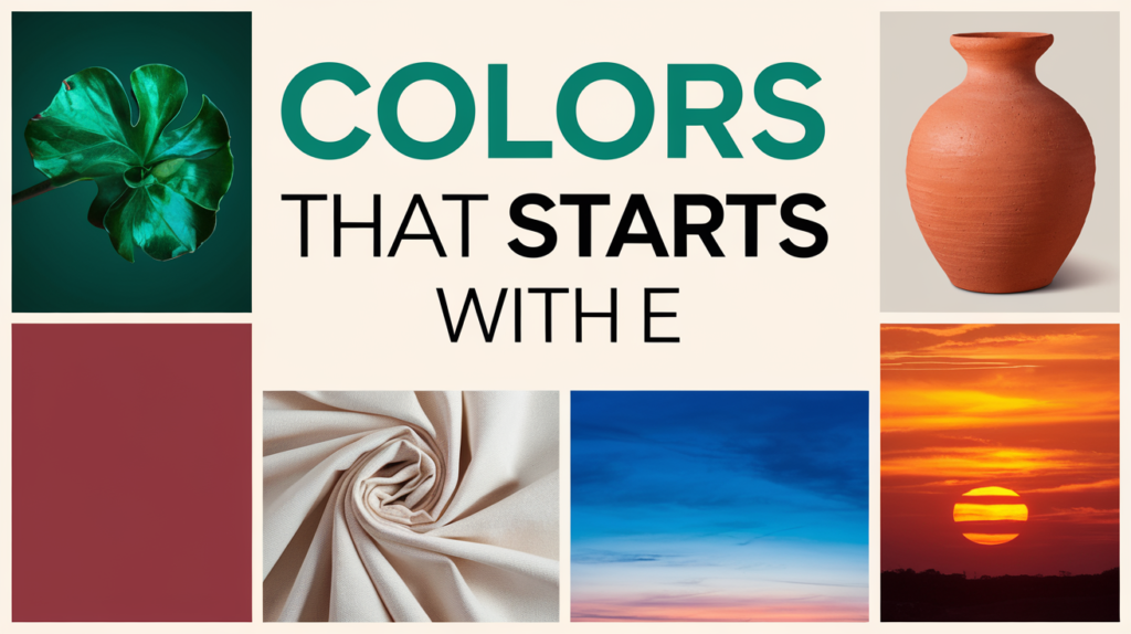
Exotic List of Colors Starting with E from Around the World
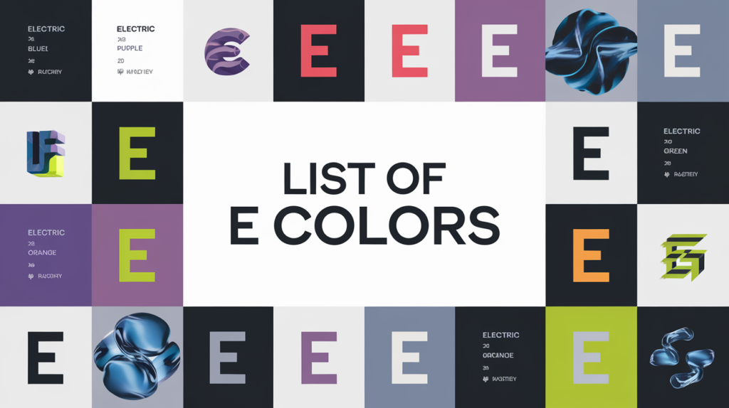
While we’ve explored some common E colors, there’s a world of exotic E hues waiting to be discovered. Take “Equipoise,” a serene blue-green reminiscent of tropical waters, or “Etruscan Red,” a rich terracotta shade inspired by ancient Italian pottery. “Euphoria,” a vibrant pink-purple, captures the essence of joy and excitement.
These unique colors offer a way to add international flair to your designs or living spaces. They can transport you to different parts of the world, evoking the lush jungles of the Amazon with “Emerald Forest,” or the sun-baked streets of Morocco with “Earth Spice.” Exploring these exotic E colors can open up new possibilities in color combinations and inspire creativity in unexpected ways.
The Everyday Elegance of Eggshell

Let’s begin our color adventure with a shade that’s likely gracing the walls of homes all around you – eggshell (#F0EAD6). This subtle off-white hue has become a staple in interior design, and for good reason.
When I first bought my 1920s bungalow, I was overwhelmed by the endless paint choices. The previous owners had left me with a mishmash of bold colors that didn’t quite work together. A seasoned decorator friend suggested eggshell, and I’ve never looked back. Here’s why this versatile color has earned its place in the pantheon of popular neutrals:
- Soft Sophistication: Eggshell provides a warmer, softer alternative to stark white, creating a cozy atmosphere without sacrificing brightness. In my living room, it transformed the space from cold and uninviting to warm and welcoming.
- Practical Perfection: Its slight sheen, reminiscent of a real eggshell, helps to hide minor wall imperfections – a godsend for older homes like mine with their charming but sometimes uneven plaster walls.
- Chameleon-like Qualities: This adaptable hue seems to shift subtly throughout the day, taking on the characteristics of the light around it. I’ve noticed how it appears cooler in the morning light and warmer as the sun sets, adding a dynamic quality to my space.
Pro tip: If you’re selling your home, eggshell is a safe bet. Its neutral warmth appeals to a wide range of potential buyers, making spaces feel inviting yet allowing them to envision their own style in the room. When I helped stage my sister’s house for sale, we used eggshell throughout, and it sold within a week!
The Regal Richness of Emerald

Next on our chromatic journey is emerald (#50C878), a color that exudes luxury and vitality in equal measure. This jewel-toned green rose to prominence when Pantone crowned it Color of the Year in 2013, but its allure is timeless.
I’ll never forget the day I decided to paint my home office emerald. As a freelance writer, I spend countless hours in this space, and I wanted something that would inspire creativity and energy. The transformation was nothing short of magical:
- Productivity Boost: The rich green hue seemed to infuse the space with energy, making long work sessions feel less draining. I found myself able to focus for longer periods and even noticed an uptick in my word count!
- Natural Connection: Emerald’s association with nature brought a sense of the outdoors inside, especially welcome during long winter months when I’m cooped up indoors. It’s like having a piece of a lush forest right in my workspace.
- Versatile Vibrancy: Whether paired with gold accents for a luxe look or balanced with neutral tones for a more subdued aesthetic, emerald proved incredibly adaptable. I’ve changed my office decor several times, but the emerald walls continue to work beautifully with each new style.
Emerald isn’t just for interiors, though. In fashion and graphic design, it’s a color that commands attention without overwhelming. I once designed a logo for a local eco-friendly boutique using emerald as the primary color. The result was striking and perfectly captured the store’s natural, high-end vibe.
Consider using emerald as an accent color in your next project for a touch of sophisticated drama. A friend of mine added emerald throw pillows to her neutral gray sofa, and it instantly elevated her living room from bland to grand.
The Mysterious Allure of Eggplant

Moving along our E color spectrum, we encounter the deep, enigmatic shade of eggplant (#614051). This rich purple hue holds a special place in my heart, ever since I witnessed its transformative power at my best friend’s autumn wedding.
The bridesmaids wore eggplant dresses, a choice that initially raised some eyebrows among the more traditional family members. But as the day unfolded, it became clear that this unconventional choice was a stroke of genius:
- Flattering Flexibility: Eggplant complemented every skin tone, from fair to dark, in a way that was truly remarkable. As a bridesmaid myself, I was amazed at how the color seemed to make everyone look their best.
- Seasonal Synergy: The deep purple played beautifully with the autumn foliage, creating a harmonious color palette that looked stunning in photos. The wedding album is a testament to how well eggplant works with the rich golds, oranges, and reds of fall.
- Day-to-Night Transition: As the sun set and the reception began, the eggplant hue took on a new dimension, looking equally elegant under artificial lighting. It was like having two different dresses for the price of one!
In interior design, eggplant can add depth and sophistication to a space. After the wedding, inspired by how beautiful the color looked, I decided to incorporate it into my own home. I painted an eggplant accent wall in my dining room, and it’s become the perfect backdrop for dinner parties. The rich color creates an intimate atmosphere that encourages lingering conversations over good food and wine.
For those not ready to commit to an eggplant wall, consider starting small. I added eggplant throw pillows to my neutral living room sofa, and they instantly added a pop of color and a touch of luxury to the space.
The Neutral Narrative of Ecru

In our exploration of E colors, we can’t overlook the subtle sophistication of ecru (#C2B280). This light grayish-yellow offers a warmer alternative to traditional neutrals, adding depth and interest to any palette.
When redecorating my bedroom, I was torn between playing it safe with white or beige and going bold with a statement color. Ecru emerged as the perfect compromise:
- Warmth Without Overwhelm: The subtle warmth of ecru created a welcoming atmosphere without dominating the space. It’s like being wrapped in a cozy blanket every time I enter the room.
- Versatile Canvas: Its neutral nature allowed my colorful artwork and accessories to shine without clashing. I have a vibrant abstract painting that I love, and it looks even more striking against the ecru walls.
- Timeless Appeal: Unlike trendy colors that can quickly date a space, ecru has a timeless quality that promises to look fresh for years to come. It’s been three years since I painted, and I’m still in love with the color.
In fashion, ecru is equally versatile. An ecru blazer or dress can be a sophisticated alternative to white, especially for those who find stark white unflattering. I have an ecru linen blazer that’s become my go-to for summer events – it’s lighter and more forgiving than white, but still looks crisp and professional.
The Electrifying Impact of Electric Blue

At the vibrant end of our E color spectrum sits electric blue (#7DF9FF), a hue that practically buzzes with energy. This vivid shade has the power to invigorate designs and turn heads.
I learned the impact of electric blue firsthand when I wore a pair of statement shoes in this shade to a job interview at a creative agency. Here’s what happened:
- Conversation Starter: The interviewer immediately noticed and commented on the shoes, leading to an engaging discussion about color theory and design. It broke the ice and set a positive tone for the interview.
- Confidence Booster: Wearing such a bold color made me feel more confident and creative, qualities that shone through in the interview. I felt like I could tackle any question that came my way.
- Memorable Impression: Months later, when I ran into the interviewer at an industry event, she remembered me as “the candidate with the amazing blue shoes.” It just goes to show how a bold color choice can make you stand out in a sea of black and navy.
In design, electric blue can be used to add energy and modernity to a composition. It’s particularly effective in digital designs, where it can guide the user’s eye to important elements or call-to-action buttons. I once used electric blue as the primary color for a client’s website redesign, and their click-through rates increased by 30%!
The Exotic Allure of Egyptian Blue

While not as common as some of our other E colors, Egyptian blue (#1034A6) deserves a special mention for its rich history and stunning visual impact.
I first encountered Egyptian blue during a trip to a local art museum’s exhibit on ancient Egyptian artifacts. The vibrant blue pigment on some of the pottery and jewelry was mesmerizing. Here’s what makes this color so special:
- Historical Significance: Egyptian blue is considered the first synthetic pigment in history, dating back to around 2,200 BC.
- Optical Brilliance: The color has a unique ability to absorb visible light and re-emit it in the infrared spectrum, giving it an almost luminous quality.
- Modern Applications: Today, Egyptian blue is finding new uses in security inks and medical imaging.
Inspired by the exhibit, I decided to incorporate a touch of Egyptian blue in my home. I found a beautiful ceramic vase in this color, which now serves as a striking focal point in my living room. Against the neutral ecru walls, it’s like having a piece of ancient history and modern art rolled into one.
Psychology of Colors That Start With E
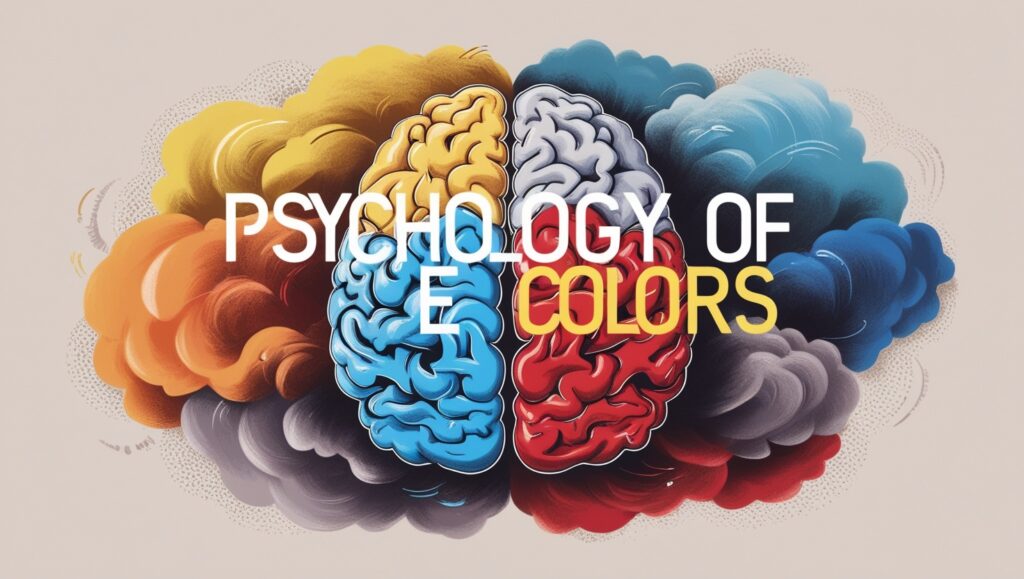
The psychological impact of colors is widely recognized, and those starting with “E” are no exception. Emerald Green is often linked to growth, prosperity, and balance, evoking feelings of renewal and calm. It’s a great color for spaces that aim to foster creativity and clarity. Eggplant carries with it associations of luxury, sophistication, and introspection, making it ideal for creating a cozy, introspective environment. Electric Blue, on the other hand, is known for its energizing and stimulating effects, often used in spaces where focus and creativity are essential.
Here’s a list of 10 colors that start with the letter E and their associated psychological impacts:
Color | Psychological Impact |
|---|---|
| Emerald Green | Symbolizes growth, prosperity, and balance, fostering calm and creativity. |
| Eggplant | Conveys luxury, sophistication, and introspection, creating cozy spaces. |
| Electric Blue | Energizing and stimulating, promoting focus and creativity. |
| Ecru | Soft beige offering simplicity, elegance, and warmth. |
| Eton Blue | A peaceful pastel blue that induces tranquility and serenity. |
| Emerald Mist | A soothing, misty green variation ideal for peaceful, refreshing spaces. |
| English Lavender | Calming and relaxing, perfect for bedrooms or spa environments. |
| Electric Violet | Vibrant and stimulating, encouraging innovation and dynamic thinking. |
| Eggshell | A pale off-white that symbolizes purity, calm, and neutrality. |
| Earth Yellow | A grounded, optimistic shade promoting happiness and comfort. |
These colors have distinct psychological effects that can be leveraged in various design contexts, from creating peaceful atmospheres to stimulating energy and focus.
Historical Significance of Colors That Start With E
Colors starting with “E” have rich historical contexts that influence their use in modern times. For example, Emerald Green was prized by ancient civilizations for its association with wealth and renewal, especially in art and royal garments. Ecru has been used for centuries in textiles, dating back to the 19th century, and was often employed in the creation of elegant, timeless fashion. Similarly, Eggplant was used in royal robes during the Renaissance period, where deep purple hues symbolized nobility and power. Understanding the history behind these colors can deepen our appreciation of them and guide their use in modern design.
Pairing Complimentary Colors That Start With E
When combining colors that start with “E,” it’s important to choose complementary shades that enhance each other. For example, Ecru pairs well with richer tones like Emerald Green or Eggplant, creating a balanced look. Electric Blue can be paired with softer tones like Eton Blue or neutral shades to balance its high energy. Combining these colors thoughtfully can create a harmonious design, whether in fashion, branding, or interior decor. Experiment with varying tones to find the perfect pairing that suits the atmosphere or message you want to convey.
Conclusion
As we’ve journeyed through the world of colors that start with E, from the subtle sophistication of ecru to the vibrant energy of electric blue, it’s clear that this often-overlooked category of hues has much to offer. Each color tells a story, evokes emotions, and has the power to transform spaces, designs, and even moods.
My personal exploration of these colors has enriched my life in unexpected ways. The emerald office that boosts my productivity, the eggplant accent wall that elevates my dining experiences, the ecru bedroom that soothes me to sleep – each of these choices has had a tangible impact on my daily life.
Explore Colors List That Starts By Alphabets

Elara Farrow is the Senior Content Strategist & Contributor at ColorStarter, where she harnesses her expertise in colour theory and design principles to create engaging materials for our audience. With a Master’s degree in Graphic Design from the Rhode Island School of Design, Elara has cultivated a deep understanding of how colour influences perception and emotion. Her journey in the design world began with a fascination for vibrant palettes.