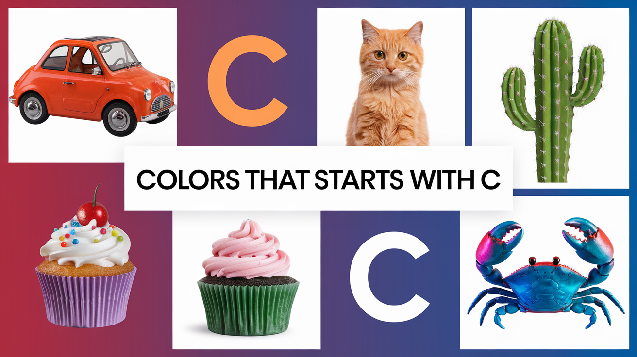
Colors starting with “C” offer a unique and captivating palette, blending vibrancy and elegance to create impactful visuals. These shades, inspired by nature and emotion, range from the fiery intensity of crimson to the calming subtleties of cream, each carrying its own significance and charm.
As a color enthusiast with 5+ years of experience and a passion for color psychology, I’ve witnessed how “C” colors can transform designs and elevate branding. Crimson, for instance, injects energy and passion into logos, while cream adds warmth and serenity to interiors. These colors don’t just decorate, they narrate stories and evoke emotions.
Join me on an immersive journey through the diverse world of colors starting with “C.” Discover their emotional undertones, design potential, and practical applications. Whether you’re an artist, designer, or color enthusiast, this guide is your gateway to unlocking the vibrant power of “C” colors in creative projects. Be sure to check out the colors list from A to Z to explore the full spectrum of color names and their meanings.
Creative Colors That Start With C in Art and Design
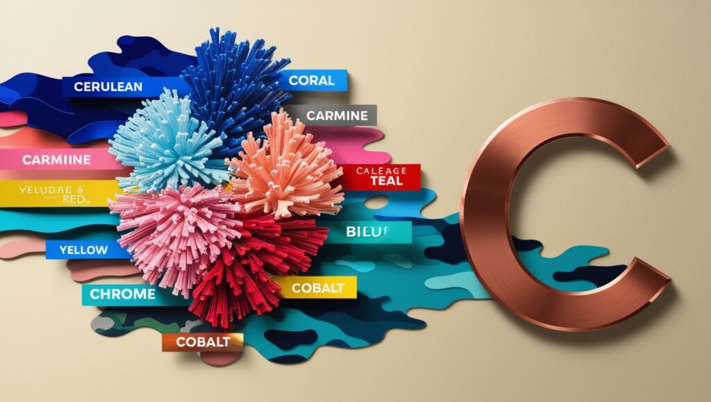
Carmine provides a deep red pigment that artists prize. Chartreuse mixes yellow and green for a bright effect. Celadon shows a pale green-gray shade in ceramics. Cobalt delivers a strong blue tone in paints and glass. Champagne offers a light golden color popular in fashion. Artists and designers use these colors to create visual impact. Each shade brings unique properties to artwork and design projects.
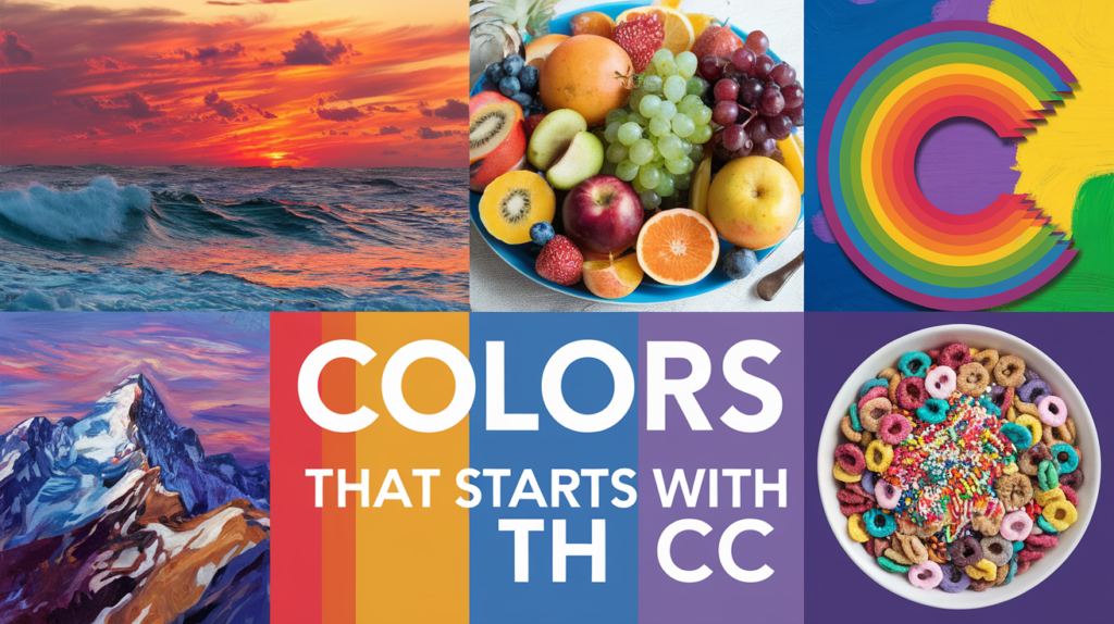
Exploring Vibrant Colors That Start With C Across the Color Wheel
Let’s begin our colorful journey with some of the most recognizable C colors. These shades are the cornerstones of the color world, frequently used in everything from art to advertising.
Crimson (#DC143C)

Crimson, a deep, rich red with a hint of blue, is a color that never fails to make a statement. I vividly remember a branding project for a high-end winery where we used crimson as the primary color. The result was a label that exuded passion, luxury, and sophistication, perfectly capturing the essence of their premium wines.
This powerful hue is associated with strong emotions like love, desire, and courage. It’s a color that demands attention and can add a touch of drama to any design. From the crimson lips of a classic Hollywood starlet to the rich hues of autumn leaves, crimson brings warmth and intensity wherever it appears.
Cyan

Cyan, a bright, cool blue-green, is a color that I find myself turning to time and again when I need to create a sense of freshness and clarity. I once used cyan as the primary color for a beachside resort’s branding, and it perfectly captured the crisp, invigorating feel of the ocean breeze.
This vibrant hue is often associated with water, sky, and technology. It’s a key player in the printing world as part of the CMYK color model. Cyan’s versatility allows it to be both soothing and energizing, depending on how it’s used. From the clear waters of a tropical lagoon to the neon lights of a cityscape, cyan brings a cool, refreshing presence to any palette.
Chocolate

Chocolate, a rich, warm brown, is a color that never fails to evoke a sense of comfort and indulgence. In a recent interior design project for a cozy coffee shop, I used various shades of chocolate for the furnishings and decor. The result was an inviting space that customers described as “warm and welcoming, like a comforting hug.”
This delicious hue is, of course, associated with its namesake treat, but it also connects us to the earth and nature. It’s a color that can add depth and richness to any design. From the smooth surface of a chocolate bar to the rich soil of a garden, this color brings warmth and comfort wherever it appears.
Cream

Cream, a soft, warm off-white, is a color that I often turn to when I need to create a sense of elegance and sophistication. In a branding project for a luxury skincare line, we used cream as the primary color. It perfectly conveyed the product’s promise of smooth, radiant skin while maintaining an air of understated luxury.
This versatile hue sits at the intersection of white and yellow, offering the purity of white with a touch of warmth. It’s a popular choice in interior design, fashion, and wedding palettes. From the smooth surface of a pearl to the soft petals of a magnolia flower, cream brings a touch of refined beauty to any setting.
Unveiling Obscure Colors That Start With C Hidden Gems in the Palette
Now that we’ve covered the classics, let’s venture into the realm of lesser-known C colors. These unique hues can add depth and interest to your color palette, setting your designs apart from the ordinary.
Celadon

Celadon, a soft, pale green with a hint of blue, is a color that I discovered during a trip to Asia and have been enamored with ever since. In a recent branding project for a wellness spa, I used celadon as the primary color. It perfectly captured the calming, rejuvenating experience the spa offered, creating a visual oasis for stressed clients.
This serene hue is named after a type of ceramic glaze, and it carries with it a sense of history and craftsmanship. It’s a color that can bring a touch of tranquility and sophistication to any design. From the gentle hues of jade to the soft tones of spring leaves, celadon offers a refreshing alternative to more common greens.
Cerulean

Cerulean, a deep sky-blue, is a color that never fails to transport me to lazy summer days spent gazing at clear skies. I recently used cerulean as the primary color for an airline’s rebranding, and it beautifully conveyed a sense of limitless possibilities and adventure.
This vivid hue is often associated with calm, open spaces and clarity of thought. It’s a color that can bring a sense of serenity and expansiveness to any design. From the vast expanse of a cloudless sky to the clear waters of a mountain lake, cerulean captures the essence of natural beauty and freedom.
Coral

Coral, a warm pinkish-orange, is a color that I find irresistibly cheerful and energizing. In a recent packaging design for a line of tropical fruit juices, I used coral as the accent color. It perfectly captured the vibrant, sun-soaked essence of the product, making the bottles practically leap off the shelves.
This lively hue is named after the marine invertebrates that build colorful reef structures. It’s a color that bridges the gap between pink and orange, offering the best of both worlds. From the delicate hues of a sunset to the vibrant tones of exotic flowers, coral brings a touch of warmth and vitality to any palette.
Expanding Your Horizon With Captivating Colors That Start With C
Our journey through the spectrum of C colors continues as we expand our chromatic horizon. Beyond the well-known hues lie a treasure trove of captivating colors waiting to be discovered. Each of these shades brings its own unique character and charm to the palette, offering fresh possibilities for creative expression.
As we delve deeper into this vibrant world, we’ll uncover hues that range from subtle and sophisticated to bold and energetic. These colors may not be as famous as their cousins crimson or cyan, but they possess an allure all their own. Whether you’re a designer seeking new inspiration or simply a color enthusiast, these additional C colors are sure to intrigue and inspire.
Carmine

Carmine, a deep, rich red with a slight purple tinge, is a color that never fails to catch the eye. I vividly recall using carmine in a branding project for a boutique winery. The deep, luscious hue perfectly captured the essence of their bold, full-bodied reds, creating a visual taste of the wine before the bottle was even opened.
This intense color has historical significance, originally derived from the cochineal insect. It’s been used in art and textiles for centuries, valued for its depth and richness. From the plush velvet of theater curtains to the glossy shine of a candied apple, carmine brings an air of luxury and indulgence wherever it appears.
Chartreuse

Chartreuse, a vibrant yellow-green, is a color that I find both challenging and exciting to work with. In a recent packaging design for an energy drink, I used chartreuse as the primary color. The result was electrifying – the bottles practically vibrated on the shelf, perfectly embodying the product’s promise of a energetic boost.
Named after the French liqueur, chartreuse sits at the midpoint between yellow and green. It’s a color that demands attention and can add a burst of energy to any design. From the bright plumage of tropical birds to the glow of fireflies on a summer night, chartreuse brings a touch of natural vibrancy and zest to any palette.
Copper

Copper, a warm, metallic orange-brown, is a color that I’ve grown to appreciate more and more over the years. In a recent interior design project for a trendy gastropub, we used copper accents throughout the space – in light fixtures, bar tops, and decorative elements. The result was a warm, inviting atmosphere with a modern, industrial edge that customers loved.
This versatile hue is inspired by the metal of the same name, carrying associations of conductivity, durability, and warmth. It’s a color that can add a touch of sophistication and warmth to any design. From the sheen of a newly minted penny to the glow of autumn leaves, copper brings a rich, earthy elegance to any setting.
Celeste

Celeste, a pale sky blue, is a color that never fails to bring a sense of lightness and air to a design. I recently used celeste as the primary color in branding for a cloud storage company. It perfectly captured the concept of limitless space and seamless technology, creating a visual metaphor for the service they provided.
This delicate hue is reminiscent of clear spring skies and has a refreshing, uplifting quality. It’s a color that can bring a sense of space and tranquility to any design. From the soft blue of a robin’s egg to the pale expanse of a morning sky, celeste offers a gentle touch of heavenly serenity.
Cinnamon

Cinnamon, a warm, spicy brown, is a color that I often turn to when I want to add a touch of comfort and exotic allure to a design. In a packaging project for a line of artisanal teas, we used cinnamon as the primary color for the chai blend. The warm, inviting hue immediately evoked the rich, spicy flavors of the tea, making it stand out on crowded shelves.
This rich hue is, of course, inspired by the beloved spice. It carries with it associations of warmth, comfort, and exotic locales. From the rich tones of wooden furniture to the warm fur of a bear, cinnamon brings a cozy, inviting presence to any color scheme.
Understanding the Psychology of Colors That Start With C and Their Impact

Colors have a profound impact on our thoughts, emotions, and behaviors. Understanding the psychological effects of C colors can help you use them more effectively in your designs and everyday life.
| Crimson: Passion and Power Crimson is a color that ignites passion and exudes power. It’s no coincidence that it’s often used in romantic contexts and for symbols of authority. In my experience, incorporating crimson into designs for luxury brands or passionate causes often helps to convey a sense of importance and emotional intensity. |
| Cyan: Clarity and Calm Cyan is associated with clarity, calmness, and cleanliness. It’s a color that can make spaces feel more open and minds feel more clear. I’ve found that using cyan in designs for tech companies or health-related services often helps to convey a sense of efficiency and purity. |
| Chocolate: Comfort and Reliability Chocolate evokes feelings of comfort, warmth, and reliability. It’s a color that can make spaces feel more grounded and products seem more substantial. In my design work, I’ve often used chocolate tones to create a sense of tradition and trustworthiness, particularly for brands that want to emphasize their history or natural ingredients. |
| Cream: Elegance and Purity Cream is perceived as elegant, pure, and calm. It’s a color that can create a sense of spaciousness and refinement. In branding projects, I’ve used cream to convey a sense of luxury and timelessness, particularly for high-end fashion or beauty brands. |
| Carmine: Passion and Luxury Carmine evokes feelings of passion, luxury, and sophistication. In my experience, using carmine in designs for high-end products or romantic themes often helps to convey a sense of opulence and emotional intensity. |
Practical Ways to Bring Colors That Start With C Into Your Designs
Now that we’ve explored the spectrum and psychology of C colors, let’s look at some practical ways to incorporate these hues into various aspects of life and design.
- C colors offer a wealth of options for graphic designers. Crimson can be used to create passionate, energetic designs that grab attention. Cyan can bring a sense of clarity and freshness to tech-related designs. Chocolate can add warmth and reliability to brands that want to emphasize comfort or tradition. And cream can create an elegant, sophisticated backdrop for luxury brands.
- In interior design, C colors can set the mood for entire spaces. A crimson accent wall can add drama and passion to a living room. Cyan curtains or accessories can bring a fresh, airy feel to a bathroom. Chocolate-colored furniture can create a cozy, inviting atmosphere in a study. And cream walls can open up a space, creating an elegant, neutral backdrop for other design elements.
- C colors are versatile players in the fashion world. A crimson dress can make a bold, passionate statement. Cyan accessories can add a fresh pop of color to an outfit. Chocolate-colored leather goods can add a touch of warmth and sophistication. And cream serves as a timeless neutral that pairs well with almost any other color.
Conclusion
As we conclude our chromatic journey through the world of colors that start with C, it’s clear that this group of hues offers a rich and diverse palette for designers, artists, and color enthusiasts alike. From the bold and passionate crimson to the serene and sophisticated cream, C colors provide a range of options to suit any project or preference.
Whether you’re creating a new brand identity, redesigning your living space, or simply looking to understand color theory better, the C color family has something to offer. By understanding the characteristics, psychology, and applications of these colors, you can harness their power to create more effective and appealing designs.
So the next time you’re faced with a color choice, consider the captivating charm of C colors! Explore the passion of crimson, the freshness of cyan, the warmth of chocolate, and the elegance of cream. And don’t forget to venture into the world of more obscure C colors like celadon, cerulean, and coral. Each of these hues has its own unique charm and potential to transform your designs and your world.
Related Colors List That Starts By Alphabets

Elara Farrow is the Senior Content Strategist & Contributor at ColorStarter, where she harnesses her expertise in colour theory and design principles to create engaging materials for our audience. With a Master’s degree in Graphic Design from the Rhode Island School of Design, Elara has cultivated a deep understanding of how colour influences perception and emotion. Her journey in the design world began with a fascination for vibrant palettes.