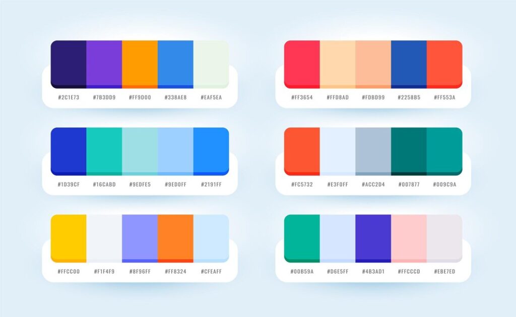
Understanding which colors complement one another is crucial in creating a visually harmonious design. Complementary colors are those that sit opposite each other on the color wheel and can create a vibrant contrast when paired together. For instance, red and green not only evoke the festive spirit of the holiday season but also bring a dynamic energy to any design.
Similarly, blue and orange work together to instill a sense of balance and excitement, making them ideal for bold branding and eye-catching visuals. Purple and yellow exemplify striking contrasts that can add depth and intrigue to a design, while softer combinations like pastel pink and mint green can create a serene and inviting atmosphere. By thoughtfully selecting complementary colors, designers can enhance their work’s emotional impact and aesthetic appeal, ensuring a captivating experience for all viewers.
The Importance of Understanding Color Combinations
Grasping the nuances of color combinations is fundamental for designers and anyone involved in visual communication. Colors influence emotions and perceptions, guiding the viewer’s experience and reaction. When designers understand how colors interact, they can create palettes that evoke the desired feelings—whether it’s serenity with cool tones or excitement with vibrant hues.
Additionally, effective color combinations enhance clarity and readability, ensuring that a message is not only aesthetically pleasing but also easily understood. By mastering color theory, designers can elevate their work, crafting environments and experiences that resonate deeply with audiences, ultimately fostering a stronger emotional connection and lasting impact.
Colors That Complement Red | What Color Goes with Red

When choosing colors to pair with red, consider its color psychology, the mood and impact you wish to convey. White creates a sharp contrast that enhances red’s vibrancy, making it feel energetic and bold. Black adds sophistication, perfect for a more dramatic effect. For a softer balance, gray provides a subtle refinement, allowing red to stand out without overwhelming the overall palette. Gold introduces a sense of luxury, beautifully accentuating red’s warmth. Additionally, blue can add an unexpected twist, providing a striking yet harmonious balance that brightens the overall look while retaining the intensity of red. To explore more combinations, check out what color goes with red for additional insights and tips.
Colors That Complement Black | What Color Goes with Black

When it comes to pairing colors with black, the options are vast and can greatly influence the overall aesthetic. White remains a timeless pairing, creating a sharp and classic contrast that exudes elegance. Adding in bold colours such as red or fuchsia can make a striking statement, enhancing the dramatic nature of black while infusing energy into the palette. Metallics like gold and silver introduce a sense of luxury and sophistication, making them perfect for upscale designs. On the softer side, pastels can lighten the weight of black, providing a delicate balance that maintains an air of elegance.
Colors That Complement Green | What Color Goes with Green

When considering what color goes with green, several options can enhance its vibrant qualities. White offers a fresh and clean contrast, amplifying green’s natural appeal. Brown introduces an earthy tone, fostering a calming atmosphere. Yellow adds a cheerful brightness, energizing the palette and creating a sense of joy. For a more contemporary look, gray balances green’s vibrancy while maintaining a sophisticated edge. Additionally, blue can provide a serene complement, evoking a feeling of tranquility and harmony. Each of these colors can transform green into a dynamic component of any design. Read in detail here to explore what color goes with green.
Colors That Complement Blue | What Color Goes with Blue

When considering colors that pair well with blue, several combinations can create striking visuals. White offers a fresh contrast, enhancing blue’s brightness and clarity. Gray provides a sleek and modern feel, complementing blue’s calmness without overwhelming it. For a vibrant look, yellow introduces a cheerful pop that energizes the palette. Coral adds warmth, creating an inviting atmosphere while maintaining a buoyant style. Finally, earthy tones like brown or terracotta can ground blue, adding depth and richness to the overall design. Each of these colors can beautifully enhance blue’s versatile allure.
Colors That Complement Orange | What Color Goes with Orange

When selecting colors to pair with orange, several combinations can evoke warmth and vibrancy. Blue acts as a complementary hue, providing a refreshing contrast that enhances orange’s energy. Gray offers a modern touch, softening orange’s boldness while maintaining a sophisticated look. For a cheerful palette, yellow can brighten the mix, fostering a sense of joy. Brown adds an earthy tone, grounding the vibrancy of orange. Meanwhile, teal introduces an unexpected pop, creating a lively and dynamic atmosphere in any design application. Each of these combinations contributes to a lively visual experience.
Colors That Complement Pink| What Color Goes with Pink

When looking to pair colors with pink, several combinations can create a charming palette. White provides a fresh and crisp contrast, enhancing pink’s sweetness. Gray offers a sophisticated touch, balancing the brightness of pink with a modern feel. Navy blue can introduce depth and elegance, while gold adds a luxurious accent, perfect for upscale designs. For a vibrant look, pairing pink with green can create an energetic dynamic, while pastels, such as mint or lavender, deliver a soft and romantic aesthetic, making pink versatile for various design expressions.
Colors That Complement Purple | What Color Goes with Purple

When pairing colors with purple, a range of options can enhance its richness. Yellow offers a striking contrast, brightening the palette and providing an energetic feel. White creates a fresh and airy backdrop that allows purple’s vibrancy to shine. For a sophisticated look, gray brings a modern touch, balancing purple’s boldness. Gold adds a luxurious accent, perfect for elegant designs. Meanwhile, green can introduce a natural element, creating harmony and depth. Each of these combinations allows purple to transform into a captivating focal point in any design scheme.
Colors That Complement Brown | What Color Goes with Brown

When selecting colors to pair with brown, several options can create a warm and inviting palette. Cream or beige provides a soft contrast, lightening the heaviness of brown while maintaining a cozy atmosphere. Green introduces a natural element, fostering a sense of tranquility. For a more vibrant touch, orange adds energy and warmth, creating a lively mix. Blue, particularly in lighter shades, offers a refreshing contrast that enhances brown’s earthy tones. Lastly, navy can introduce sophistication, making brown feel more refined and elegant in various design contexts.
Colors That Complement Yellow | What Color Goes with Yellow

When choosing colors to pair with yellow, several options can enhance its brightness and warmth. Gray provides a modern backdrop, softening yellow’s vibrancy while maintaining elegance. Blue serves as a striking contrast, bringing a refreshing balance to the palette. For a cheerful combination, white amplifies yellow’s lightness. Green introduces a natural element, creating a lively and harmonious effect. Additionally, purple offers a bold complement, adding depth and richness to the overall design. Each of these colors can beautifully highlight yellow’s sunny qualities, creating an inviting visual experience.
Colors That Complement Gray | What Color Goes with Gray

When pairing colors with gray, various combinations can create a balanced and sophisticated palette. White provides a clean and fresh contrast, enhancing gray’s versatility. Yellow introduces a cheerful pop, brightening the overall look and adding warmth. Blush pink offers a subtle touch of softness, creating an inviting atmosphere. For a modern feel, teal adds a vibrant accent, while black can provide a striking, bold contrast. Lastly, earthy tones like olive green or terracotta can ground gray, fostering a natural and harmonious design that feels both contemporary and warm.
Related Articles:
- Complete List of Colors from A to Z – Discover Every Color Name
- Colors That Start with A: A Vibrant Journey from Amaranth to Azure
- Decode Color Meanings and Symbolism – Guide to Colors
- Shades of Colors Names: A Designer’s Comprehensive Guide
Conclusion
In summation, the intricate world of color theory plays a crucial role in the realm of design. By understanding how different colors interact with one another, designers can craft spaces and products that not only look visually appealing but also evoke specific feelings and moods. The thoughtful pairing of complementary colors can create striking contrasts or harmonious blends, making a meaningful impact on the viewer’s experience.
As we continue to explore the endless possibilities of color combinations, the key lies in experimentation and intuition, allowing creativity to flourish while embracing the emotional resonance that colors hold. This guide serves as a foundation for designers, encouraging bold choices and innovative thinking, ultimately leading to breathtaking and impactful designs.

Elara Farrow is the Senior Content Strategist & Contributor at ColorStarter, where she harnesses her expertise in colour theory and design principles to create engaging materials for our audience. With a Master’s degree in Graphic Design from the Rhode Island School of Design, Elara has cultivated a deep understanding of how colour influences perception and emotion. Her journey in the design world began with a fascination for vibrant palettes.