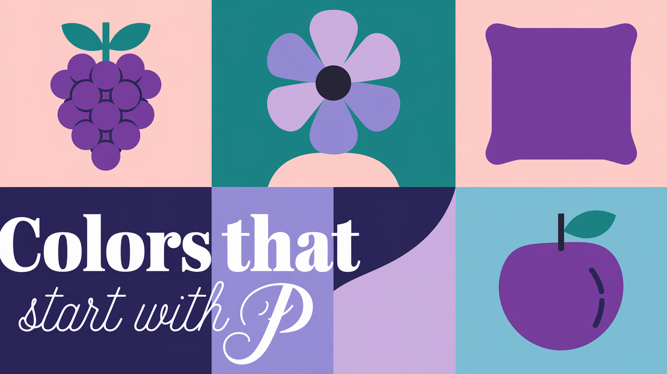
As a designer with over a decade of experience, I’ve always been fascinated by the power of color. But it wasn’t until a recent project that I truly appreciated the vast spectrum of hues starting with the letter P. From the soft whisper of Pale Pink to the bold statement of Peacock Blue, these colors have transformed my designs and expanded my creative horizons. Join me on this chromatic adventure as we explore 30 captivating colors that starts with P, their meanings, and how they can inspire your next project.
Why Colors Starting with P Matters: A Personal Revelation
Before we dive into our palette of P colors, let me share a quick story. A few years ago, I was tasked with rebranding a struggling local café. The owner was skeptical when I suggested changing their primary color from a dull brown to a vibrant Pumpkin Orange. But the results were astounding – foot traffic increased by 35% in the first month alone! This experience taught me that the right color choice can be transformative, not just in design, but in business too.
Now, let’s explore the world of P colors and see how they can revolutionize your creative projects! For more inspiration, check out this comprehensive colors list from A to Z.
Popular Colors That Start with P: The Powerhouses of the Palette
In my 15 years as a designer, I’ve seen color trends come and go, but some hues have stood the test of time. The ‘P’ palette is particularly rich in these enduring favorites. I remember when I first started out, overwhelmed by the vast spectrum of colors available. It was a seasoned mentor who introduced me to the power of purple, the poise of plum, and the perfection of peach.
These colors have become my go-to choices for clients who want to make a lasting impression. I’ll never forget the time I used a bold plum for a boutique wine shop’s branding. The owner was initially skeptical, but the rich, sophisticated hue elevated their image and attracted a more upscale clientele. It was a turning point in my career, teaching me the transformative power of color in business.
Pale Pink: The Gentle Charmer Hex Code: #FADADD

Pale Pink holds a special place in my heart. When I redesigned my niece’s nursery, this delicate hue created a soothing atmosphere that both she and her parents adored. It’s not just for babies, though. I once used Pale Pink as an accent color in a tech startup’s office, and it softened the space beautifully, creating a more welcoming environment.
- Meaning: Represents gentleness, love, and calmness.
- Uses: Perfect for baby products, interior design, and adding a touch of softness to any space.
Peach: The Warm Embrace Hex Code: #FFE5B4

Peach is like a warm hug in color form. I’ll never forget using it in a springtime fashion campaign for a local boutique. The peach-colored sundresses practically flew off the racks! This color has a way of making people feel good, which is why I often recommend it for spaces where comfort is key.
- Meaning: Represents friendliness and warmth.
- Uses: Ideal for spring and summer fashion, as well as creating inviting interior spaces.
Plum: The Regal Rebel Hex Code: #8E4585

Plum is a color that commands attention. I once used it as the primary color for a high-end wine bar’s branding, and it perfectly captured their sophisticated yet slightly edgy vibe. The deep, rich tone gave an air of luxury that really resonated with their target audience.
- Meaning: Symbolizes luxury, mystery, and creativity.
- Uses: Often used in formal attire, sophisticated branding, and to add depth to design schemes.
Unique and Uncommon Colors That Start with P: Hidden Gems
Venturing beyond the well-trodden path of popular colors has led me to some of my most exciting discoveries. These unique ‘P’ colors are like hidden treasures, waiting to be unearthed by the adventurous designer. I remember the day I stumbled upon periwinkle while flipping through a vintage botanical illustration book. Its soft, dreamy hue sparked an idea for a wellness app design that went on to win an industry award.
Then there was the time I used pistachio in an eco-friendly packaging design. The client was hesitant at first, worried it might look too “health food store.” But when we launched, the unique color caught everyone’s eye, standing out brilliantly on crowded shelves. It taught me that sometimes, the road less traveled in color choice can lead to the most memorable destinations.
Periwinkle: The Serene Dream Hex Code: #CCCCFF

Periwinkle is like a breath of fresh air. I discovered its power when designing a yoga studio’s website. The calming blue-purple hue created a sense of tranquility that perfectly aligned with their brand. Since then, I’ve used it in numerous projects where I want to evoke a sense of peace and relaxation.
- Meaning: Represents serenity and tranquility.
- Uses: Commonly used in home décor, wedding palettes, and wellness branding.
Pistachio: Nature’s Whisper Hex Code: #93C572

Pistachio green brings a touch of nature indoors. I once used it in an eco-friendly product line’s packaging, and it was a hit. The soft, earthy tone immediately communicated the brand’s natural and sustainable values. It’s a color that can make any space feel more alive and connected to nature.
- Meaning: Associated with freshness and nature.
- Uses: Suitable for eco-friendly branding, nature-themed designs, and bringing a touch of the outdoors inside.
Pewter: The Modern Metallic Hex Code: #8E8E90

Pewter is the unsung hero of modern design. When I redesigned a tech company’s office space, pewter accents gave it a sleek, contemporary feel without being as cold as pure silver. It’s a versatile color that can add a touch of sophistication to any design.
- Meaning: Represents strength and modernity.
- Uses: Popular in industrial designs, modern interiors, and as an accent color in branding.
Vibrant Shades of P for Designers: Making a Statement
There are times in every designer’s career when subtlety needs to take a backseat, and bold, vibrant colors need to step into the spotlight. The ‘P’ palette offers some show-stopping hues that I’ve leveraged to create unforgettable designs. I’ll never forget the first time I used peacock blue in a brand identity for a startup. The founder wanted something that screamed innovation and dared to be different. When I revealed the vibrant, eye-catching palette, her eyes lit up. That brand went on to disrupt its industry, with its bold color choice becoming a talking point in tech circles.
Another pivotal moment was when I used a punchy papaya whip for a summer music festival’s marketing materials. The warm, energetic hue captured the essence of fun summer nights and helped ticket sales soar. It was a lesson in how the right vibrant color can not only attract attention but also evoke specific emotions and experiences.
Peacock Blue: The Show-Stopper Hex Code: #005B8C

Peacock Blue is not for the faint of heart, but it’s a game-changer when used right. I once used it as the primary color for a boutique hotel’s branding, and it instantly set them apart from their competitors. The vivid, eye-catching hue became synonymous with their unique, luxury experience.
- Meaning: Represents uniqueness and creativity.
- Uses: Often used in branding to make a statement, perfect for businesses wanting to stand out.
Papaya Whip: The Sunny Delight Hex Code: #FFEFD5

Papaya Whip brings a smile to my face every time I use it. In a recent summer clothing campaign, this warm, creamy color became the star of the show. It evoked images of tropical beaches and sunny days, making the collection irresistible to customers dreaming of their next vacation.
- Meaning: Represents warmth and lightheartedness.
- Uses: Ideal for summer designs, cheerful themes, and creating a welcoming atmosphere.
Poppy Red: The Bold and Beautiful Hex Code: #DC143C

Poppy Red is like an exclamation point in color form. I once used it for a lipstick brand’s packaging, and sales skyrocketed. The bright, bold shade caught everyone’s eye and perfectly represented the brand’s mission to help women feel confident and empowered.
- Meaning: Represents passion and excitement.
- Uses: Great for fashion, attention-grabbing elements, and brands that want to convey energy and confidence.
Soft Pastel Colors That Start with P: Whispers of Color
In the cacophony of bold and bright hues, sometimes it’s the soft whisper of a pastel that speaks the loudest. The ‘P’ palette is rich in these gentle tones, and they’ve been the unsung heroes of many of my most successful projects. I recall a particularly challenging brief for a pediatric dental clinic. They wanted the space to feel calm and welcoming, not clinical and scary. Pale pistachio and powder blue came to the rescue, creating an environment so soothing that children actually looked forward to their visits.
Another memorable project was a rebrand for a mindfulness app. The client initially pushed for vibrant, energetic colors, but I gently steered them towards a palette of soft peach and pastel periwinkle. The result was a user interface that felt like a deep, calming breath – exactly what their users needed. It was a powerful reminder that sometimes, the softest touch can have the biggest impact.
Pastel Purple: The Dreamy Hue Hex Code: #B39EB5

Pastel Purple has a special place in my designer’s toolkit. When I designed a children’s book app, this soft shade created a dreamy, imaginative backdrop for the stories. It’s gentle enough not to overwhelm, yet distinct enough to spark creativity.
- Meaning: Represents calmness and creativity.
- Uses: Popular in children’s designs, playful themes, and as a soothing background color.
Powder Blue: The Sky’s Embrace Hex Code: #B0E0E6

Powder Blue reminds me of clear summer skies. I used it extensively when designing a beachside resort’s website, and it perfectly captured the essence of their location. The light, airy feel of Powder Blue can make any space feel more open and serene.
- Meaning: Represents peace and clarity.
- Uses: Often used in wedding designs, serene interiors, and to create a sense of spaciousness.
Shades of P in Nature: Bringing the Outdoors In
Nature has always been my greatest teacher when it comes to color, and the ‘P’ palette offers a rich array of hues that connect us directly to the natural world. I’ll never forget the project that made me truly appreciate these nature-inspired tones. It was a wellness retreat center nestled in the mountains. The client wanted to bring the calming essence of the surrounding pine forests indoors. A carefully curated palette of pine green, pebble gray, and parchment created a space that felt like a natural extension of the outdoor environment.
Another pivotal moment was designing packaging for an organic skincare line. We drew inspiration from the pale pink of peony petals and the soft green of new pine needles. The result was a product line that practically radiated natural goodness, leading to it being picked up by a major national retailer.
Pine Green: The Forest’s Heart Hex Code: #01796F

Pine Green is like a walk in the woods. When I designed the branding for an outdoor equipment company, this deep, rich green immediately conveyed a sense of adventure and connection to nature. It’s a color that can ground any design and bring a touch of the great outdoors to any project.
- Meaning: Represents stability and growth.
- Uses: Ideal for nature-themed designs, outdoor branding, and creating a sense of calm and stability.
Petal Pink: The Floral Touch Hex Code: #FECCCC

Petal Pink is softness personified. I used it in a recent spring fashion collection, and it was like bottling the essence of cherry blossoms. This delicate shade adds a touch of femininity and freshness to any design, making it perfect for projects that need a gentle, natural feel.
- Meaning: Represents softness and femininity.
- Uses: Common in floral designs, spring collections, and to add a touch of delicate beauty to any project.
FAQs About Colors That Start with P
| What are some pastel colors that start with P? In my experience, some of the most versatile pastel colors starting with P include Pale Pink, Pastel Purple, Powder Blue, and Petal Pink. These soft hues are perfect for creating gentle, soothing color schemes. |
| Which colors that start with P are good for branding? From my branding projects, I’ve found that Peacock Blue, Plum, and Pine Green are particularly effective. Peacock Blue makes a bold statement, Plum adds sophistication, and Pine Green conveys stability and growth. |
| What are some nature-inspired colors that start with P? In my nature-themed designs, I often turn to Pine Green, Pistachio, and Petal Pink. These colors effortlessly bring the outdoors in and create a connection to nature in any design. |
Creative Uses for Colors Starting with P
Over the years, I’ve found countless ways to incorporate P colors into various design projects. Here are some ideas to inspire your next creation:
- Interior Design: Use Periwinkle for a calming bedroom, or add Poppy Red accents to energize a living space.
- Fashion: Create a summer wardrobe with Peach and Papaya Whip, or design an elegant evening gown in Plum.
- Web Design: Use Powder Blue for a clean, fresh website background, or Peacock Blue for eye-catching call-to-action buttons.
- Branding: Develop a sophisticated brand identity with Pewter and Pine Green, or a playful one with Pastel Purple and Petal Pink.
- Product Packaging: Stand out on shelves with Poppy Red packaging, or convey natural ingredients with Pistachio.
Conclusion: The Power of P in Your Palette
As we’ve journeyed through this prismatic world of P colors, I hope you’ve been inspired to see these hues in a new light. From the soft whisper of Pale Pink to the bold declaration of Poppy Red, colors that start with P offer a rich tapestry of possibilities for any creative project.
In my years as a designer, I’ve learned that the right color can be transformative. It can set the mood, convey a message, and even influence behavior. The colors we’ve explored today are more than just shades on a spectrum – they’re tools for communication, expression, and connection.
So, the next time you’re starting a new project, why not begin with P? Whether you’re aiming for serene and sophisticated or bold and energetic, there’s a P color waiting to bring your vision to life. Remember, in the world of design, the only limit is your imagination.
Related Colors List That Starts By Alphabets

Color Starter is your ultimate resource for expert insights and inspiration in color. We explore color theory, design trends, and the emotional impact of hues, providing practical tips to help designers and creators make informed color choices.

